


Project Overview
Client HALO Integration Portal (CHIP) Project
Chip is an enterprise application that enables owners to onboard their apps and request integration with the Halo security platform.
Challenges:
Lack of UX Design Involvement:
The platform was developed without UX expertise, resulting in a lack of user-centered considerations.
Lack of UX Processes:
Educate the team on the importance of user-centric design through workshops and case studies.
Build Trust:
Communicate directly with developers and participate in stand-up calls to foster relationships and build trust within the team.
My Role:
As a UX Designer, my primary goals are:
Work across all aspects of the platform to ensure a cohesive user experience.
Conduct user research and facilitate brainstorming sessions to gather insights and innovative ideas.
Collaborate closely with architects, UI developers, product managers, and testers to develop clear, effective designs.
Enhance the user experience by redesigning the product while supporting platform expansion.
To identify the problems, I conducted research and found that the platform lacked a user-centric design, had a confusing onboarding process, lacked a home page for navigation, used non-standard components, and faced accessibility issues.
Identifying Problems
Auditing
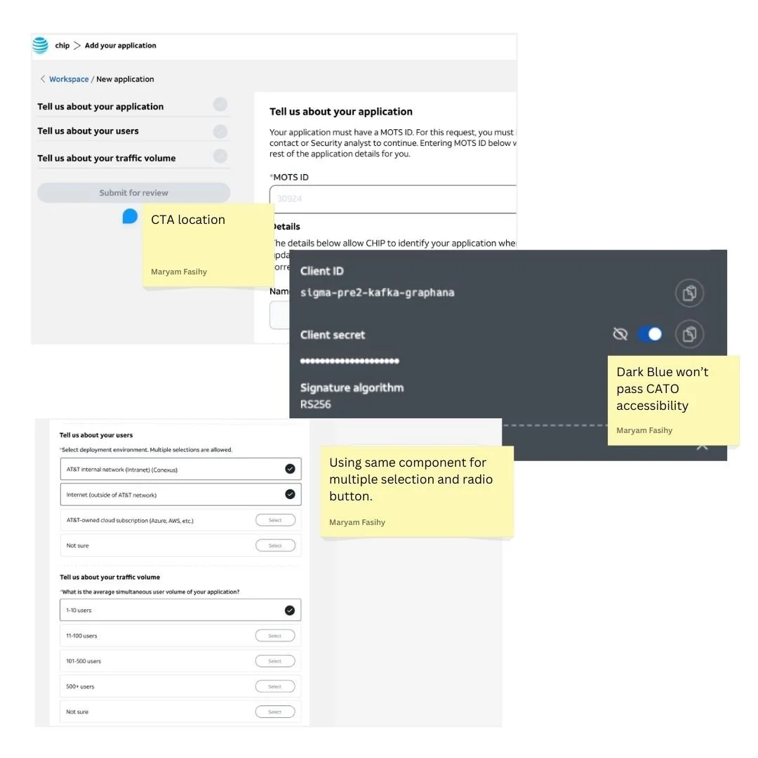
I joined the project midway and began by auditing it to assess its alignment with AT&T's design system and adherence to UX design principles, which served as the starting point for improving the platform.
User Survey
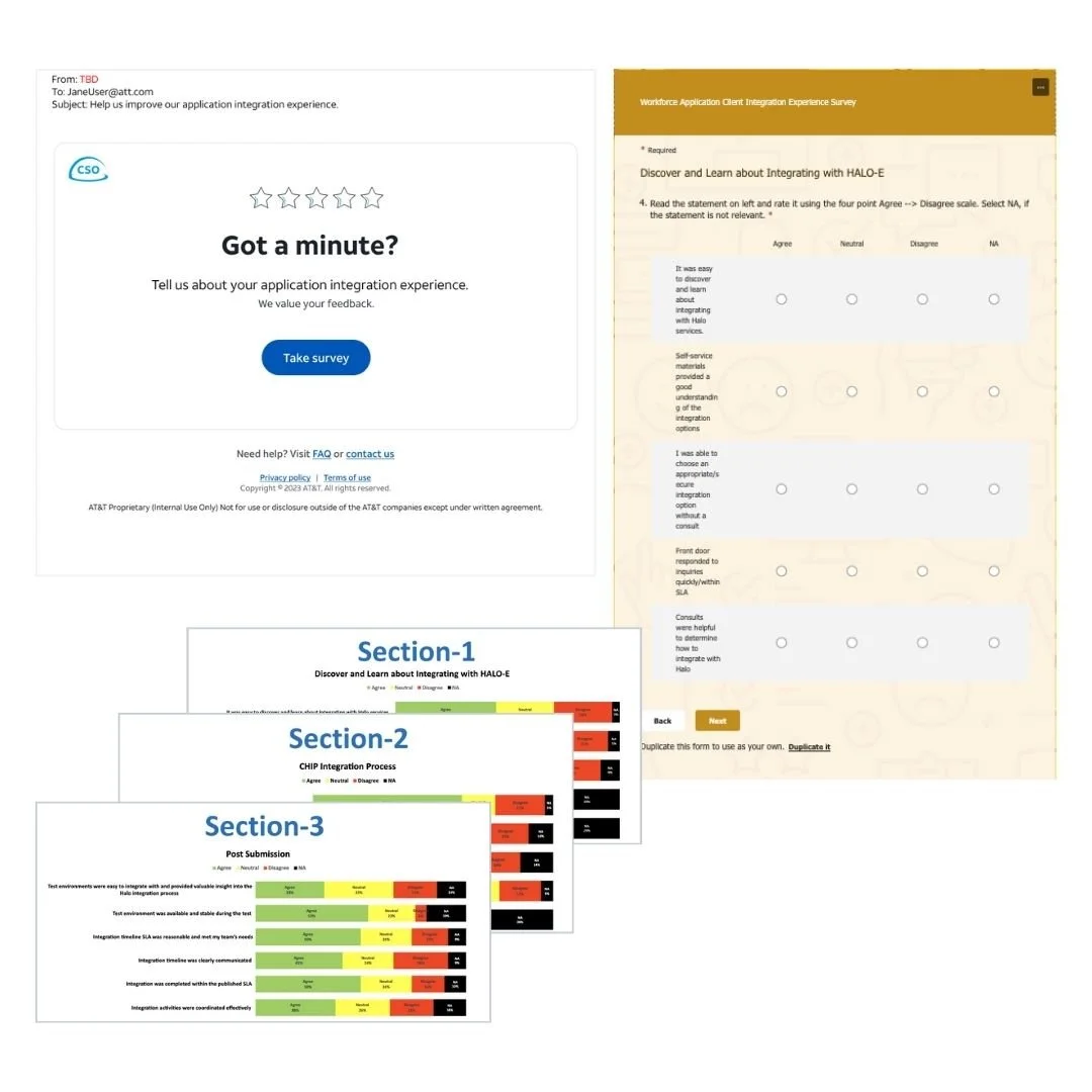
I conducted a user survey to gather feedback on the Chip application, focusing on how users interact with the platform. The survey aimed to identify pain points, usability issues, and areas for improvement, providing valuable insights to enhance the overall user experience and inform the next steps for the platform’s development.
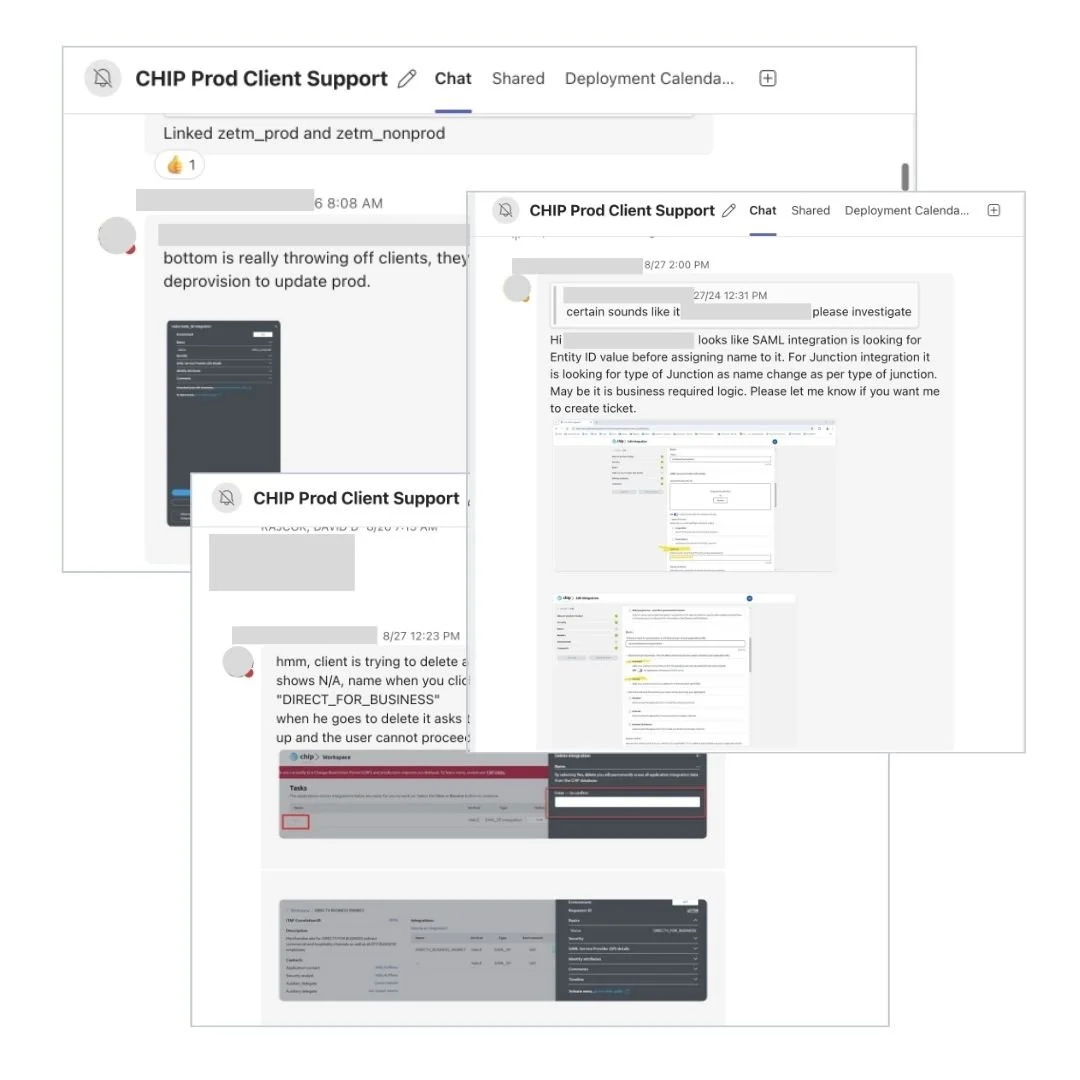
Review User Feedback
I work closely with approvers and client support teams to gather valuable feedback from users. By analyzing their struggles and pain points, I make informed design decisions to address concerns and create user-centered solutions.
Problems
Lack of User-Centric Design, the platform was built without considering the needs and preferences of the users.
Complicated User Flow, users were facing a complicated and confusing onboarding process.
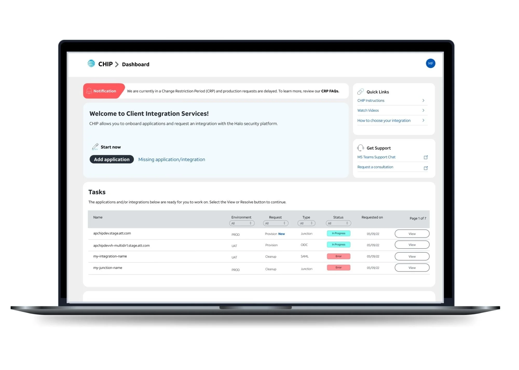
Lack of Home Page, the absence of a home page made it difficult for users to orient themselves and access important information.
Using third-party components instead of adhering to the AT&T design library.
Accessibility issues, the platform was not be accessible to all users.
Starting Point
To kick off the design process, I created wireframes of the product to document existing screens and their flow. This helped organize the structure and layout while serving as a foundation for discussions. I facilitated brainstorming sessions with team members, allowing us to collaboratively explore ideas, identify gaps, and align on improvements to enhance the user experience.
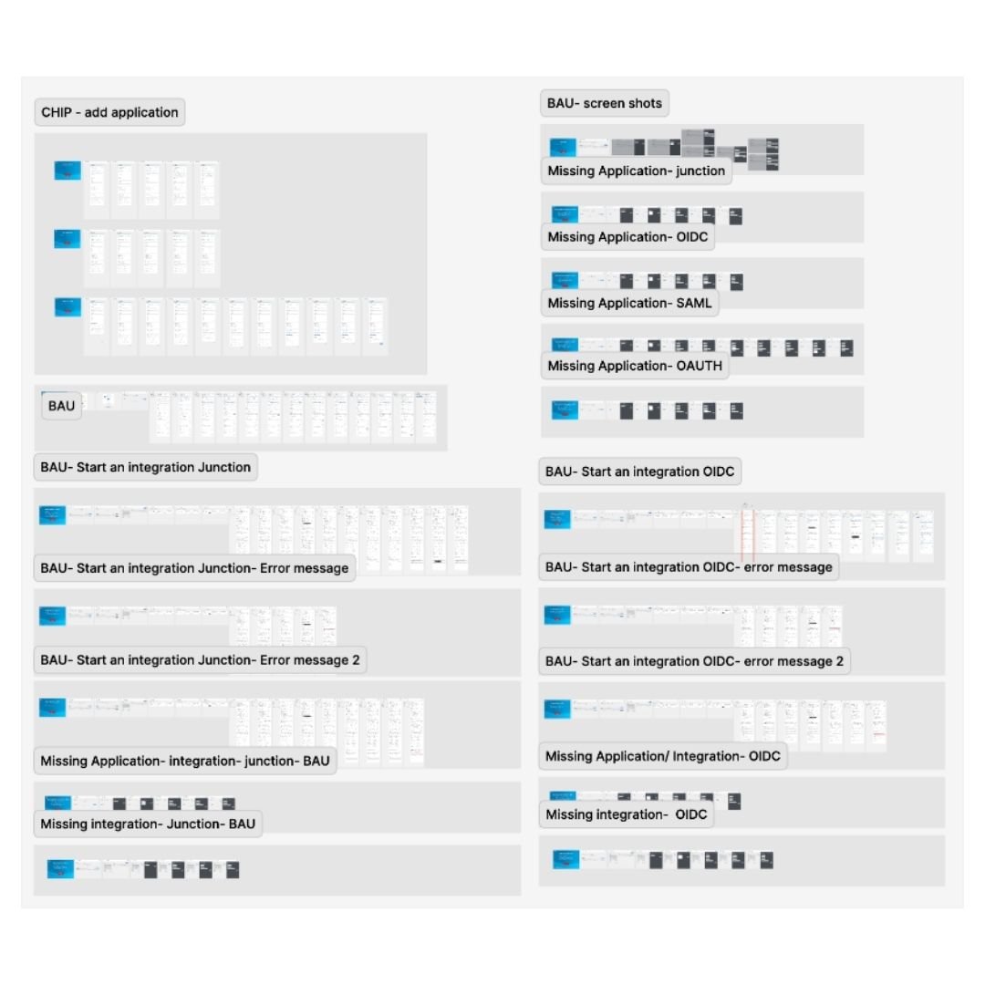
Documenting Existing Screens
I documented existing screens by creating wireframes in Figma based on the production version, with the goal of enhancing and expanding the product.
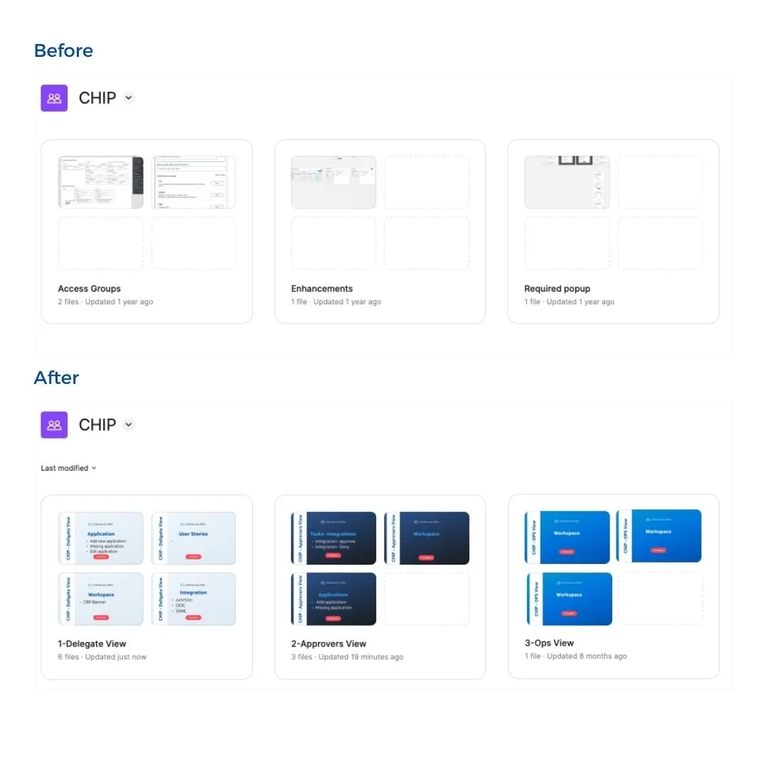
Organizing Figma Files
I reorganized all previous files to ensure easy access for product managers and developers, laying a solid foundation for the project.
Solution
Conducted user survey and gathered feedback from clients to understand user pain points and expectations.
Simplify the user flow by breaking it down into clear and logical steps.
Create a clear and welcoming dashboard that serves as a central hub for users with relevant information.
Collaborate with UI developer to have access to AT&T design system and components library.
Ensure that the platform complies with Corporate Accessibility Technology Office (CATO) compliance and meet accessibility standards.
Collaboration and Prioritization
I collaborate closely with product managers, UX designers, UX writers, developers, and testers to ensure smooth product development. Peer reviews and open communication across teams are essential to maintain alignment. When introducing new features and user stories, I prioritize tasks based on user feedback and the team’s capacity, focusing on enhancements that provide the greatest value to users.
Design Time
Based on the feedback, data, brainstorming sessions, and workshops I gathered, I began the redesign process while simultaneously supporting the product's expansion. This approach ensured that the updated design addressed user needs, resolved pain points, and aligned with the overall goals of the platform. By integrating insights from various sources, I created a user-centered design that improved functionality and scalability.
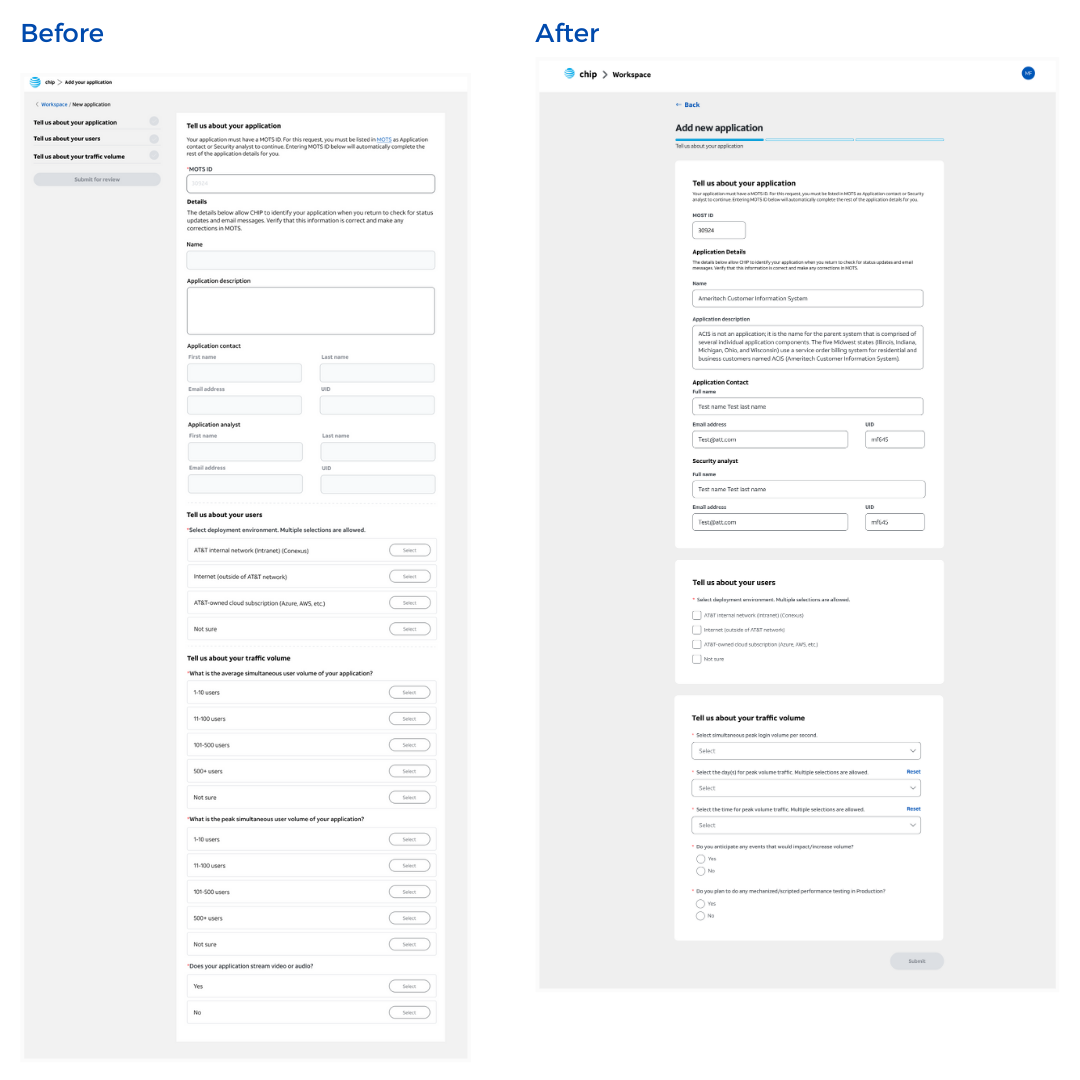
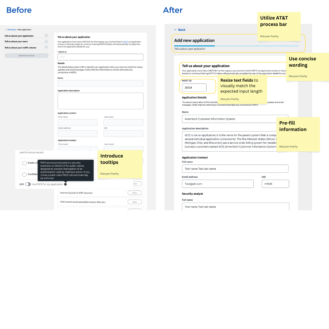
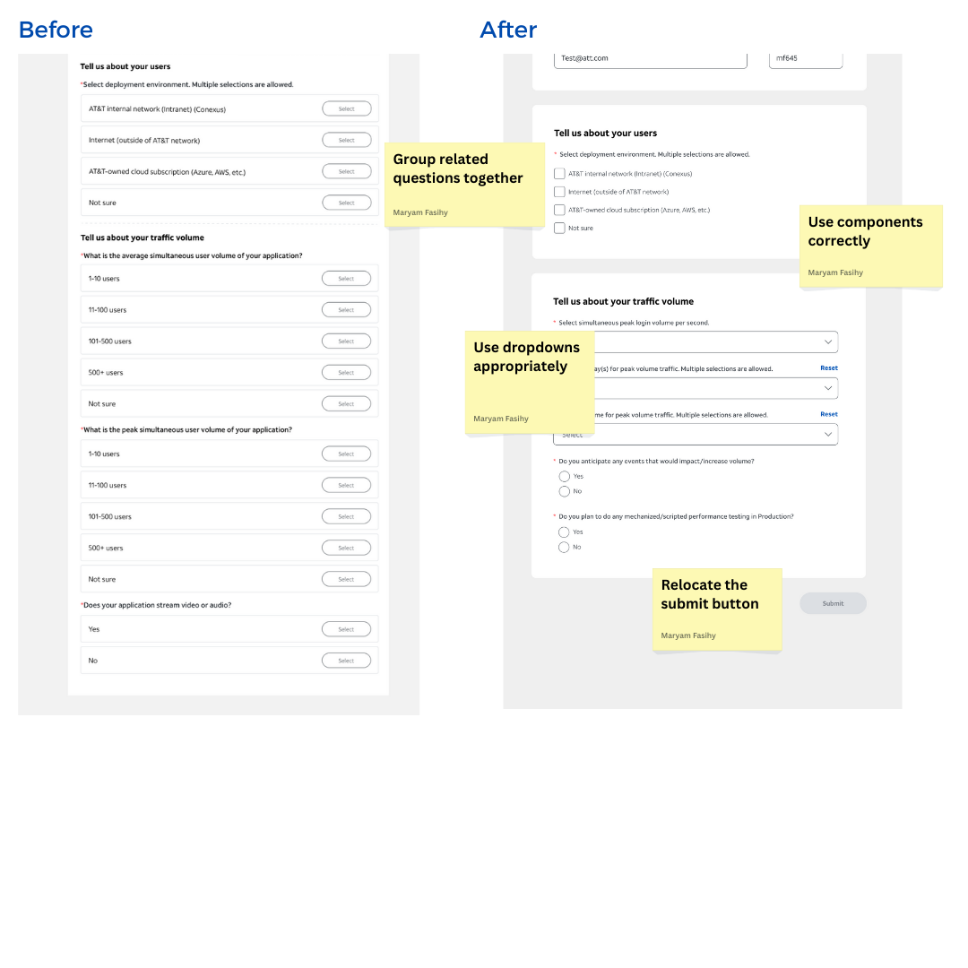
New design
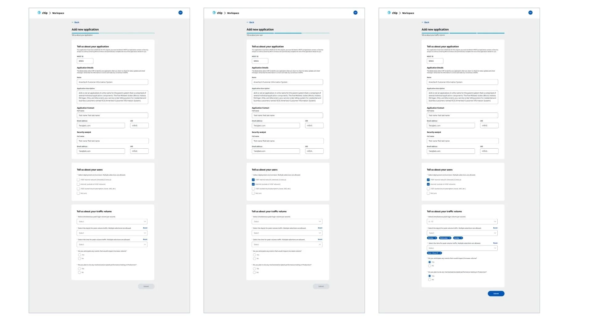
After the redesign, even with more questions, the form is shorter by utilizing the right components and making the content more concise.
Impact
The redesign and enhancement of the CHIP platform significantly streamlined the application integration process for AT&T's VPN. Now, 5,000 users actively use CHIP to integrate their applications, benefiting from a centralized, user-friendly platform.
Previously, app owners faced a fragmented process of filling out forms across different platforms and manually uploading them for integration. With CHIP, this process has been unified, making it more efficient and accessible to all users.
Additionally, collaborating with approvers and developers, I contributed to creating an online user guide. This resource empowers users to navigate the platform independently, reducing confusion and support queries while enhancing overall user satisfaction.