
Unified Access with Single Sign-On: Centralizing user access under one secure login.
This project was all about enhancing simplicity and security for AT&T’s business users. As the lead UX designer, I was tasked with merging two separate login pages into a single, cohesive experience.
The goal was clear: to streamline access by allowing users to sign in with one username and password on a unified, AT&T-branded page. From research and design to collaboration with cross-functional teams, this project reflects my commitment to user-centered solutions that align with business goals. Take a look at the journey behind this project, from early ideation to the final, polished experience.
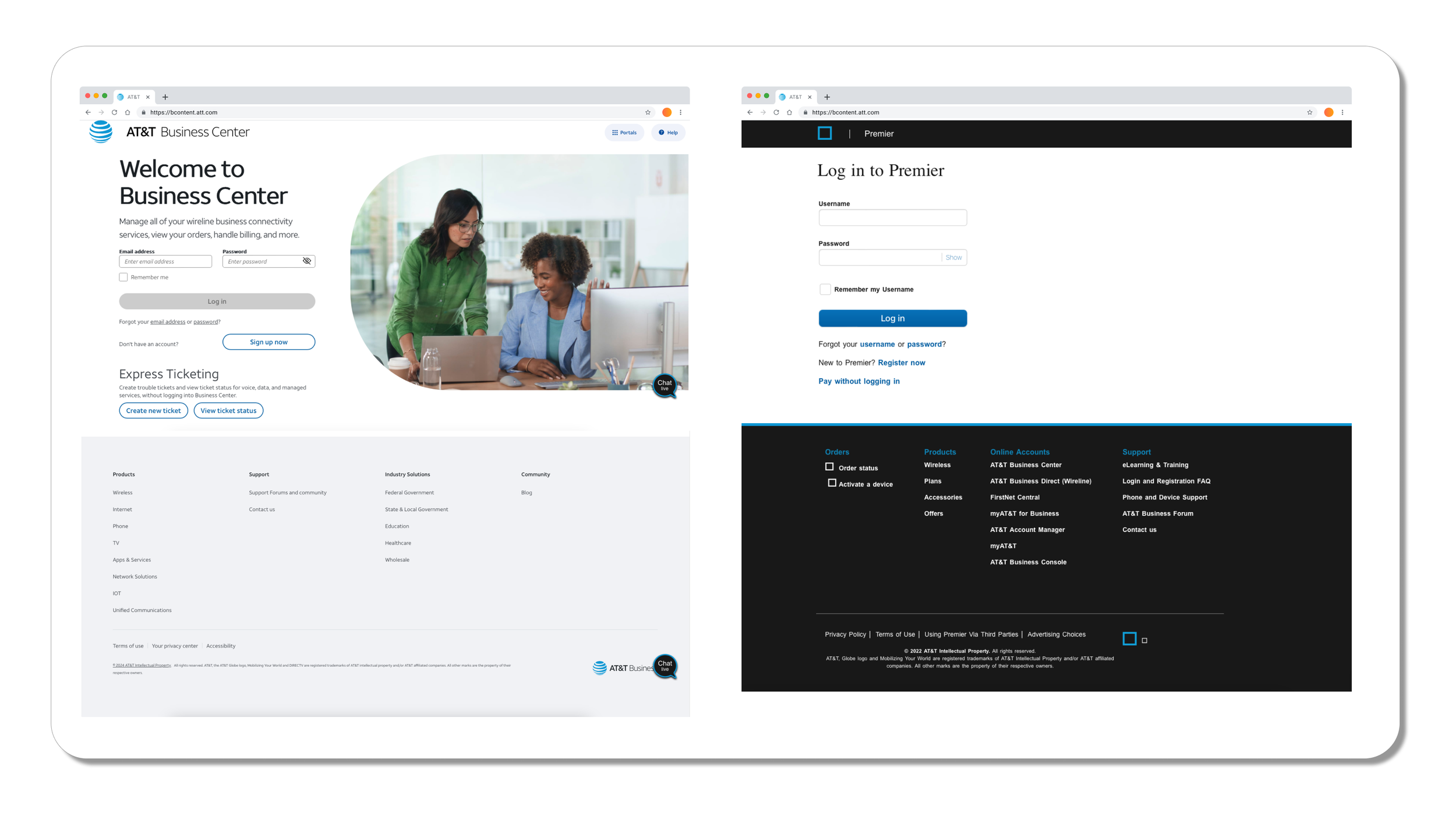
Problem
AT&T business users previously navigated between two separate login pages, causing confusion, inefficiency, and security concerns. Users required streamlined access that maintained the brand's aesthetic while providing a secure, user-friendly solution.
My Role:
Lead UX DesignerResearch & Analysis:
User Research and Insights
To design an effective solution, I conducted extensive user research, including interviews and usability studies with AT&T Business portal users. Feedback revealed common frustrations with multiple sign-in points, leading to inefficiencies, and confusion stemming from inconsistent terminology across platforms. These findings highlighted the need for a unified and streamlined experience. Based on this research, I developed the split sign-in approach and standardized terminology, directly addressing user pain points while enhancing clarity, usability, and security throughout the login process.
Challenges:
The large hero image, while engaging, occupies excessive space, pushing important elements below the fold.
Secondary links (e.g., "Sign up now" and "Forgot password") compete with primary actions, causing potential distractions.
The footer includes numerous links, which can overwhelm users despite its improved organization compared to older designs.
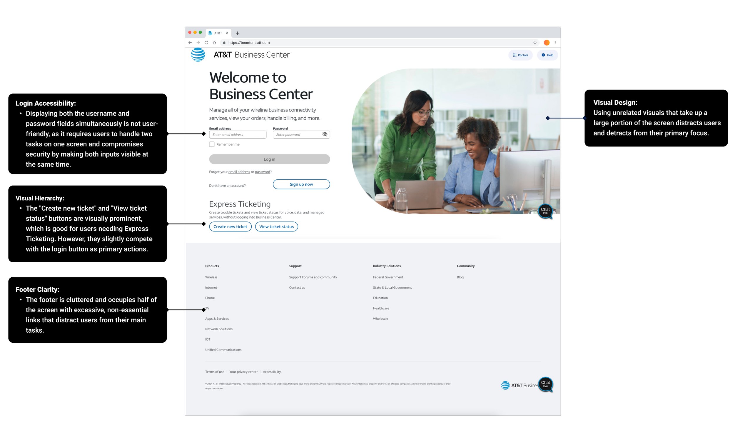
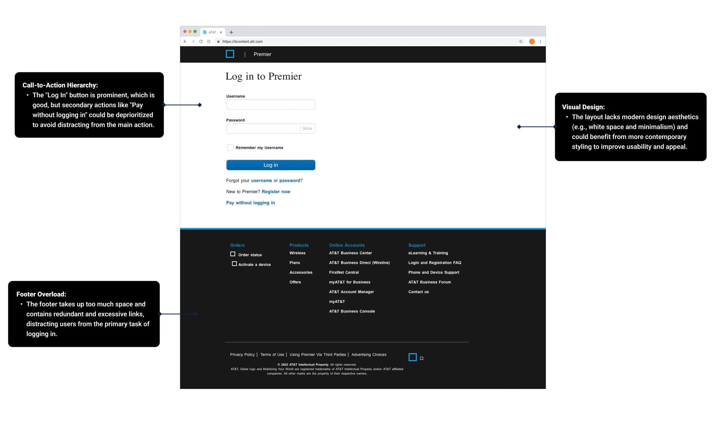
Design Solutions: This analysis highlights the importance of balancing visual appeal with usability, ensuring the user’s primary tasks remain effortless and intuitive.
Unified Interface:
Merged the two login screens into one, simplifying the visual design and decluttering content.
Reduce the hero image size to prioritize functional content above the fold.
Streamline secondary actions and group them below the login button to emphasize the primary flow.
Simplify the footer by collapsing categories and showing essential links only.
Consistency in Terminology: Ensured uniform language across interfaces to enhance usability and build user trust.
Split Sign-In: Implemented a step-by-step login process for better focus, security, and reduced cognitive load.
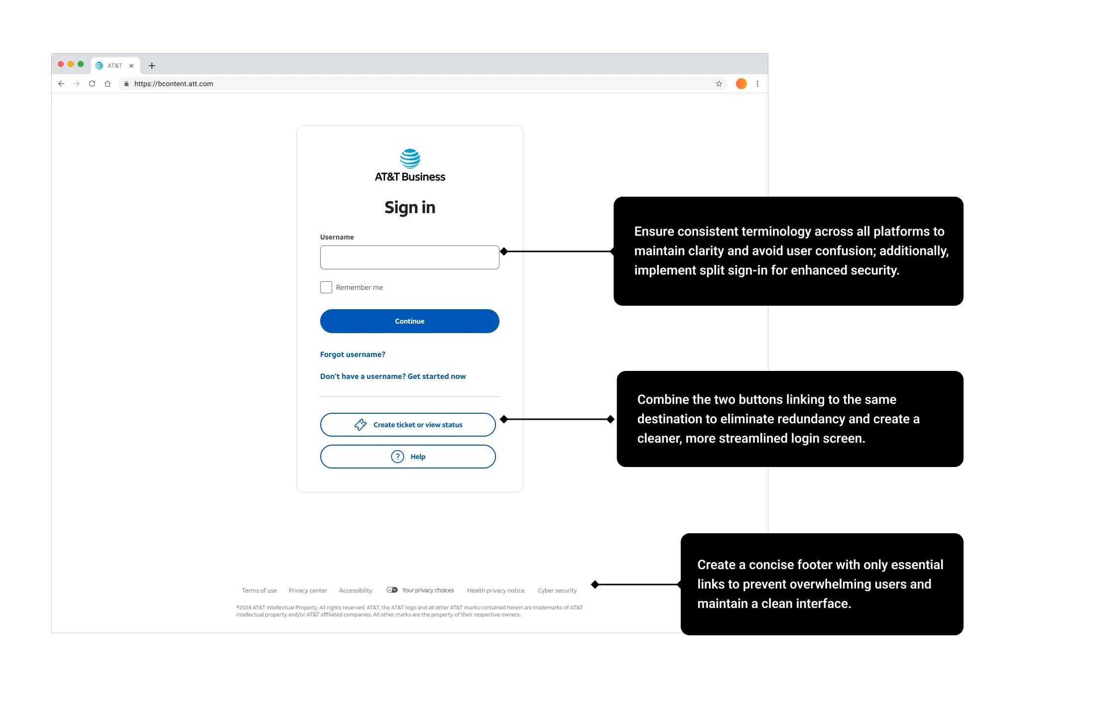
Reasons behind split sign-in: Security, User experience, and Guided flow
Split sign-in separates the username and password input into two distinct steps, enhancing security and usability. Here’s why it’s often preferred:
Security: By requesting the username first, systems can tailor security measures like two-factor authentication or CAPTCHA based on user risk before requesting the password.
User Experience: It helps users focus on one task at a time, reducing cognitive load.
Guided Flow: Easier to customize user prompts and handle forgotten username/password scenarios efficiently without overwhelming the user with both fields at once.
Implementation:
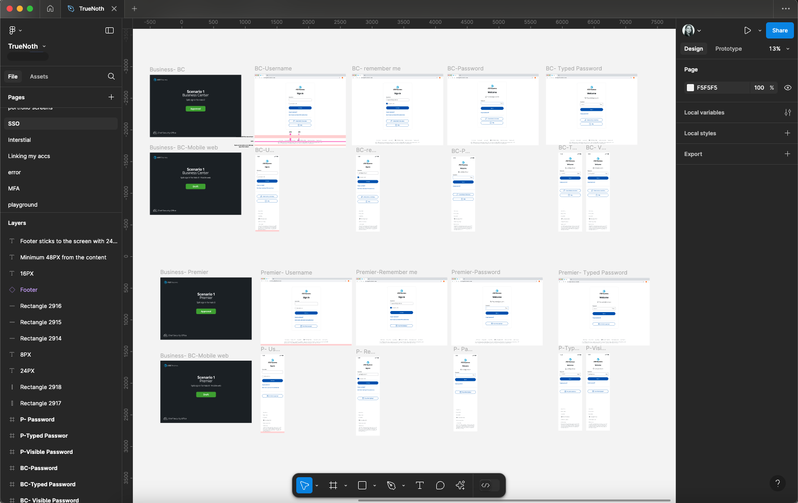
Worked closely with front-end and back-end developers, providing detailed design documentation and prototypes. The project included iterative testing phases to refine the UI and optimize interactions.
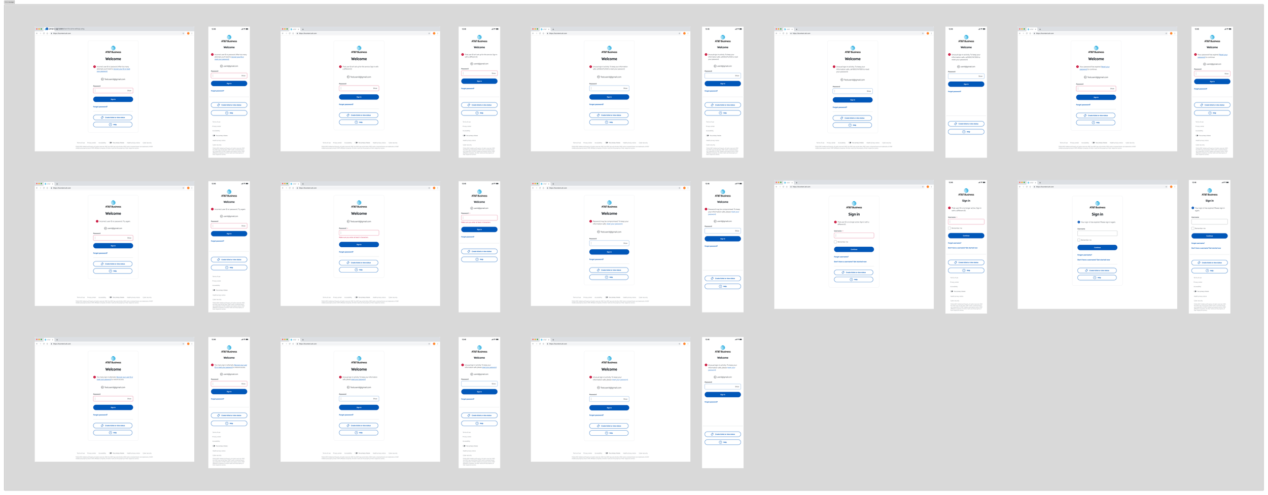
Anticipating Every Scenario: A Robust Error Messaging Framework
In designing the error-handling framework for the AT&T Business portal, I carefully anticipated and crafted error messages for all potential use cases and scenarios. From empty fields and invalid input formats to system outages and account recovery issues, each message ensures clarity, guidance, and a user-friendly tone. This thorough approach aims to minimize user frustration, maintain trust, and streamline troubleshooting, enhancing the overall login experience.
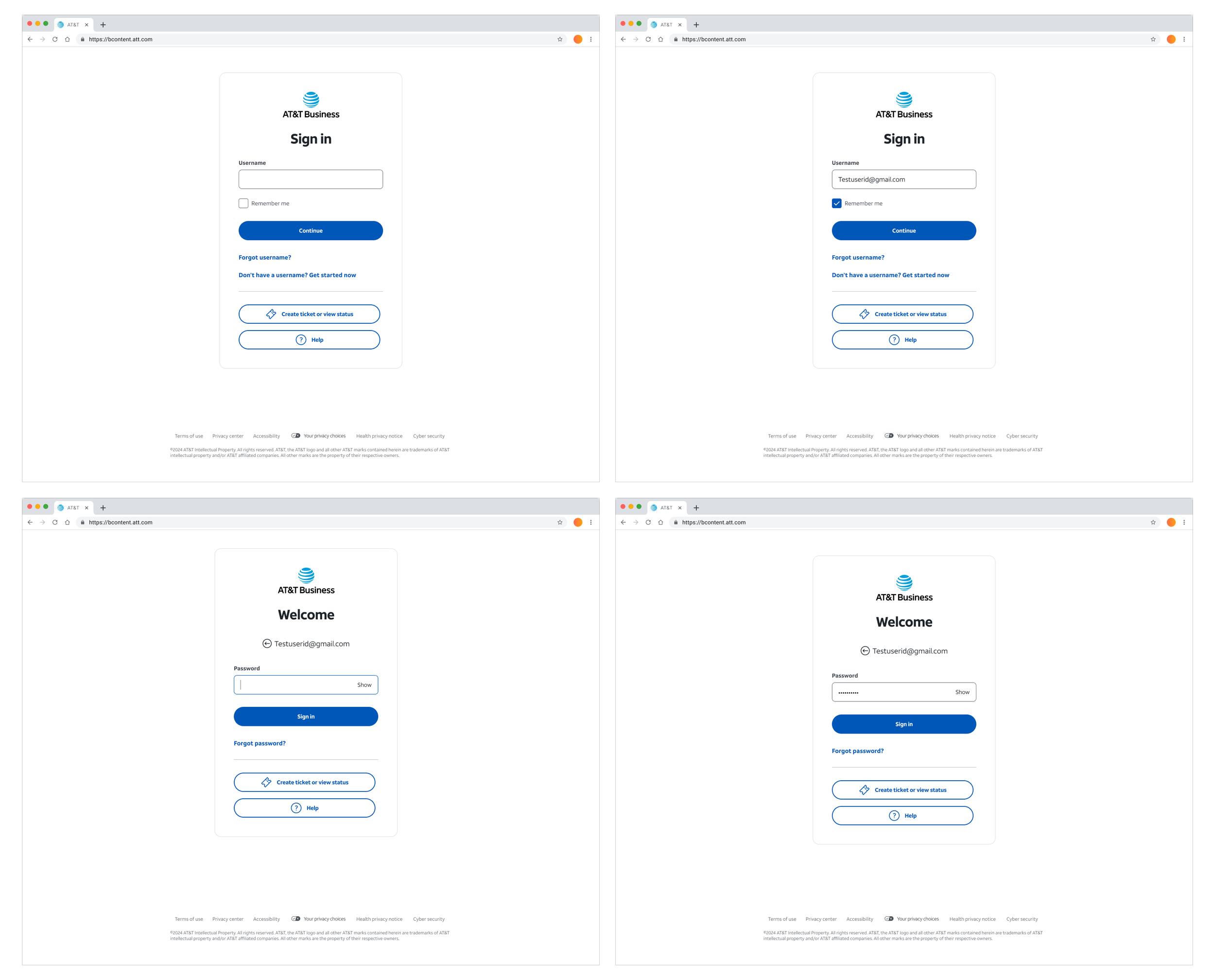
Key Features of the Final Design:
Modern Minimalism: Clean layout with ample white space to avoid distractions.
Primary CTA Focus: The “Continue” button is prominent, guiding users smoothly through the process.
Accessible Options: Secondary links like "Forgot username?" and "Pay without signing in" are present but visually deprioritized.
Improved Footer: Reduced to essential links, removing overwhelming details from the previous designs.
Results
The AT&T Business project has officially launched and is now live! I collaborated closely with testers, developers, and architects to ensure a seamless implementation. Usability testing conducted through UserZoom highlighted key improvements:
Enhanced User Experience: Users reported higher satisfaction with a more intuitive and streamlined login process.
Strengthened Security: The new design effectively deters phishing and credential-stuffing attacks.
Efficiency Gains: Login time was reduced by 15%, thanks to fewer errors and distractions.
Key Takeaways
Splitting tasks into smaller steps enhances usability.
Prioritizing essential elements reduces cognitive overload.
Iterative testing drives measurable success.Increased user satisfaction with a more intuitive login flow.