
Women of MENA in Technology
Overview
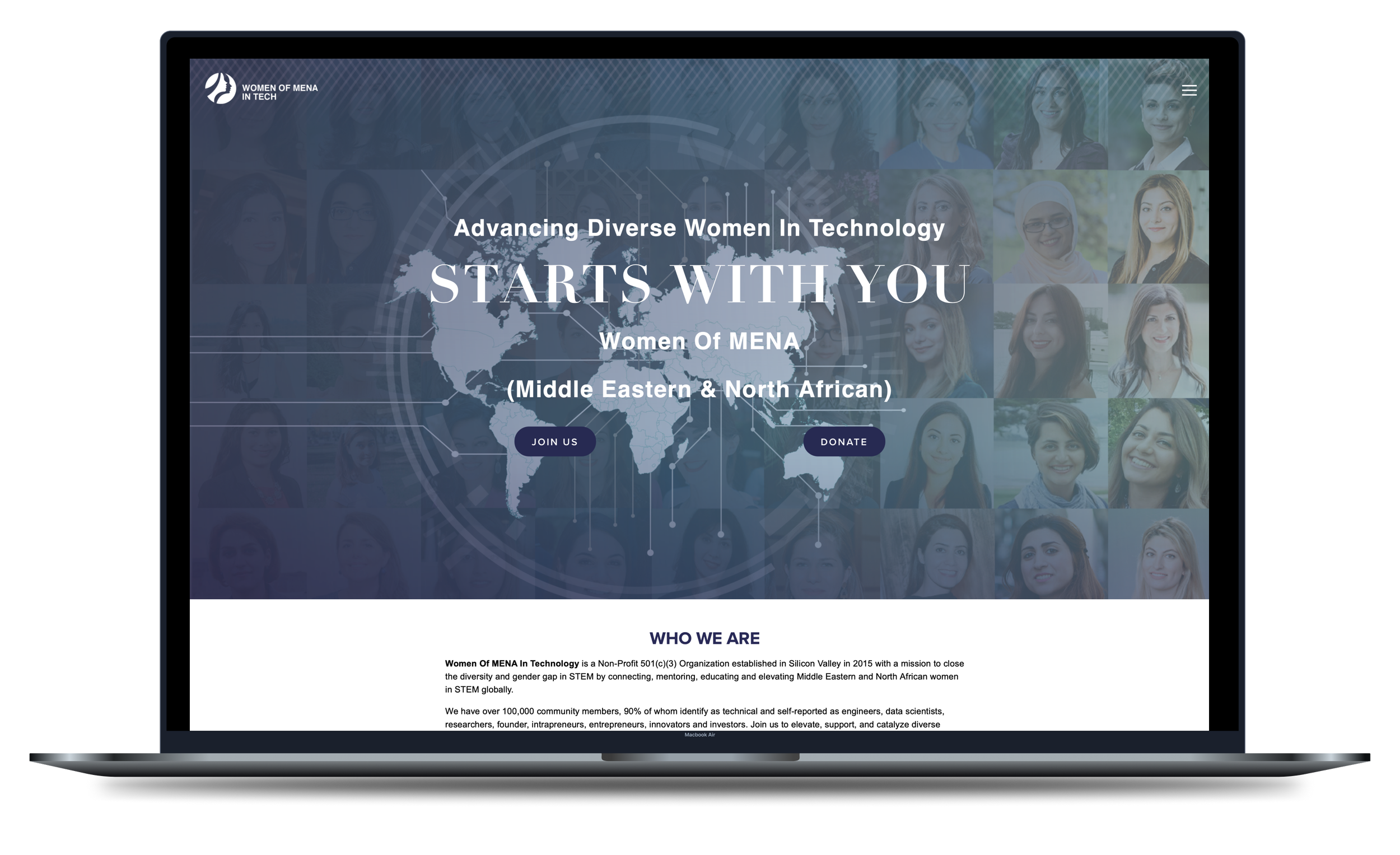
Women of MENA in Technology is a nonprofit that supports women in tech. I led a volunteer team to redesign its website, so visitors can find events and become members more easily.
My role
Design team lead, UI/UX designer, and UX researcher. I worked with the organization's leadership, a product manager, and developers.
The problem
The website was hard to use. Visitors struggled to find events and buy a membership, and the organization needed more members and revenue.
- Easy to find their way around
- Quick access to events
- A simple way to join
- More new members who stay
- More revenue
My process
I led the team through five phases, sharing results with leadership after each one.
Listen to the community.
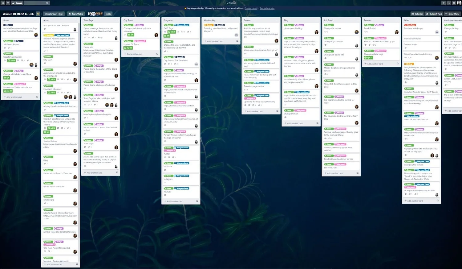
I interviewed 5 women in WoMENAIT's audience and reviewed the site's Google Analytics. Our team grouped what we heard on an affinity map: people wanted to know the programs and mission, sign up for events, and become members.
Design for Mina.
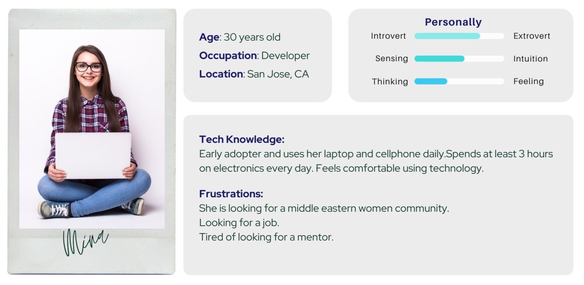
Mina stands for a large group of young professional women from the Middle East and North Africa with similar goals. She kept the team focused on what mattered most.
Map the path to joining.
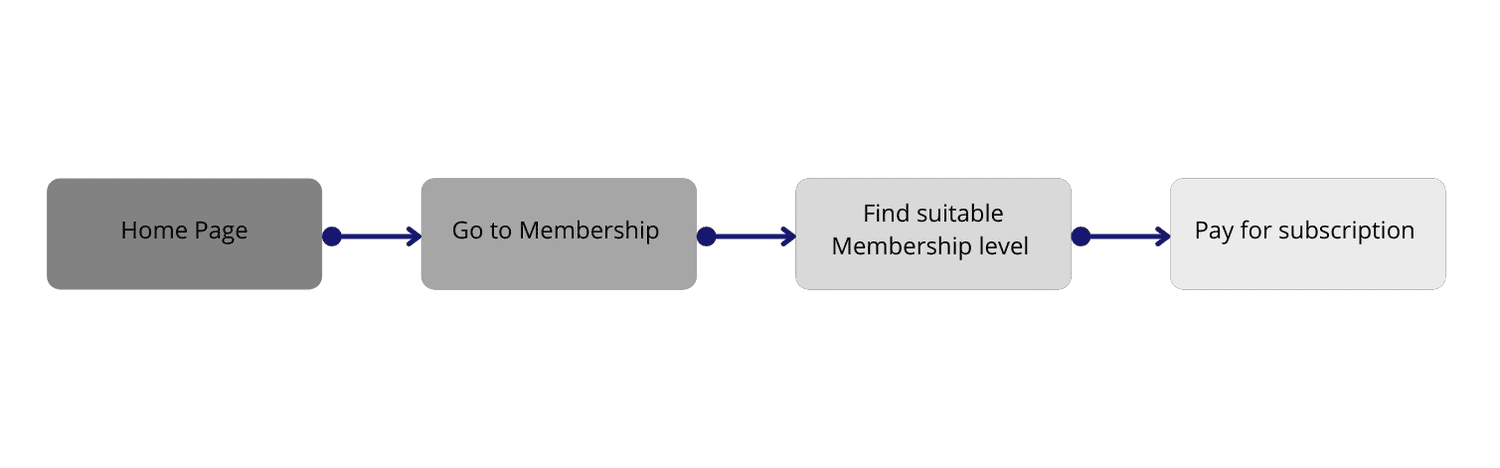
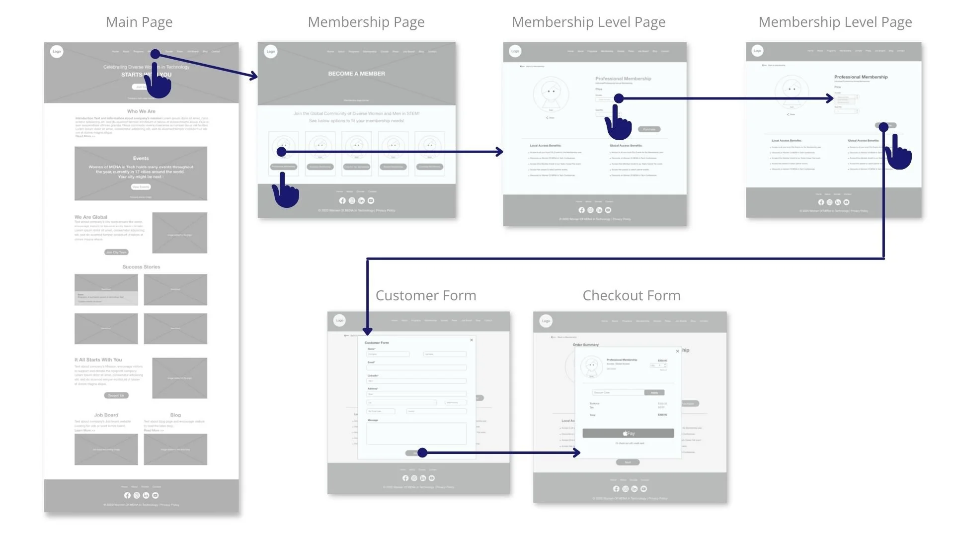
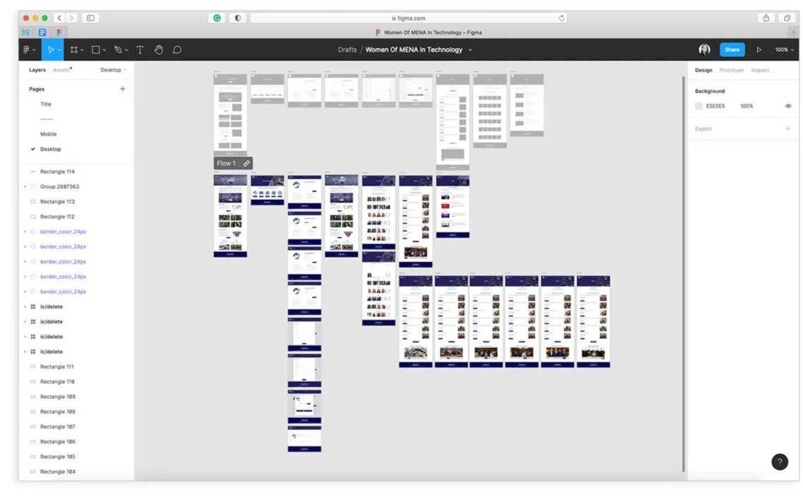
I mapped the main task, buying a membership, from landing on the home page to a confirmed payment, so every step had a clear purpose.
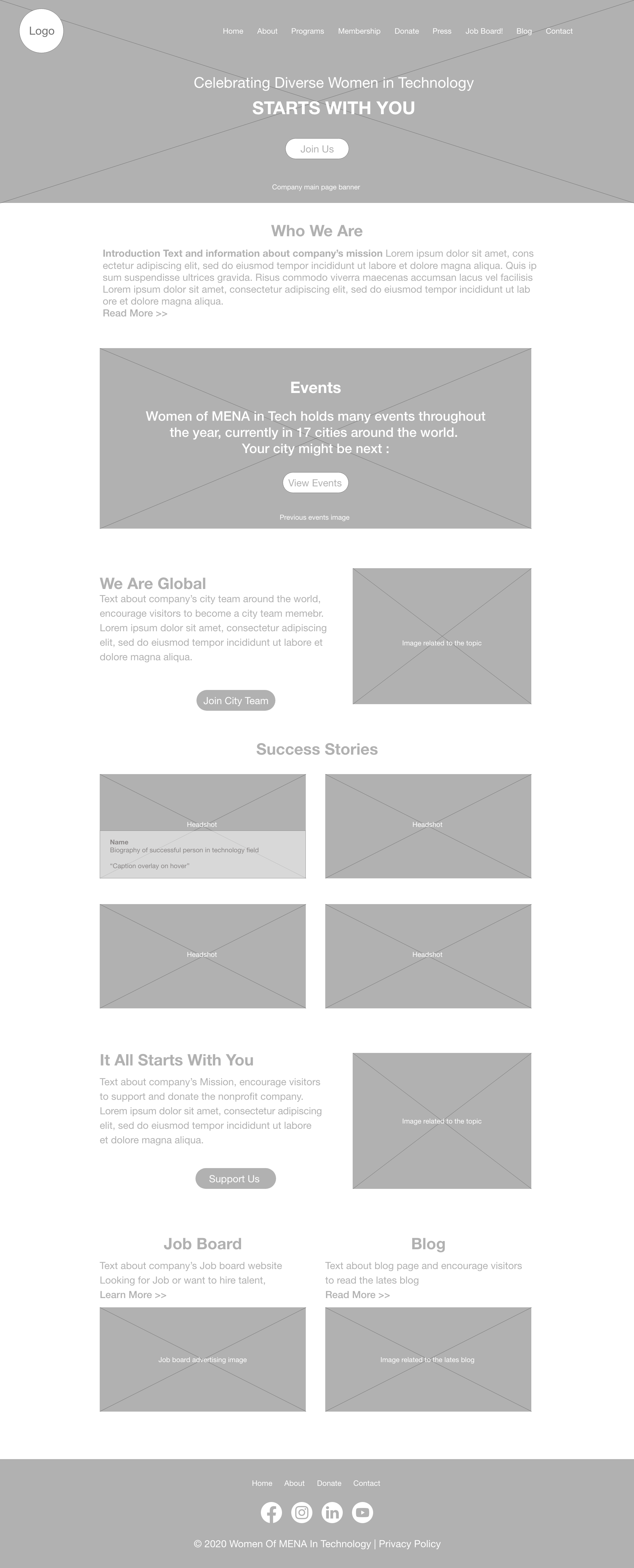
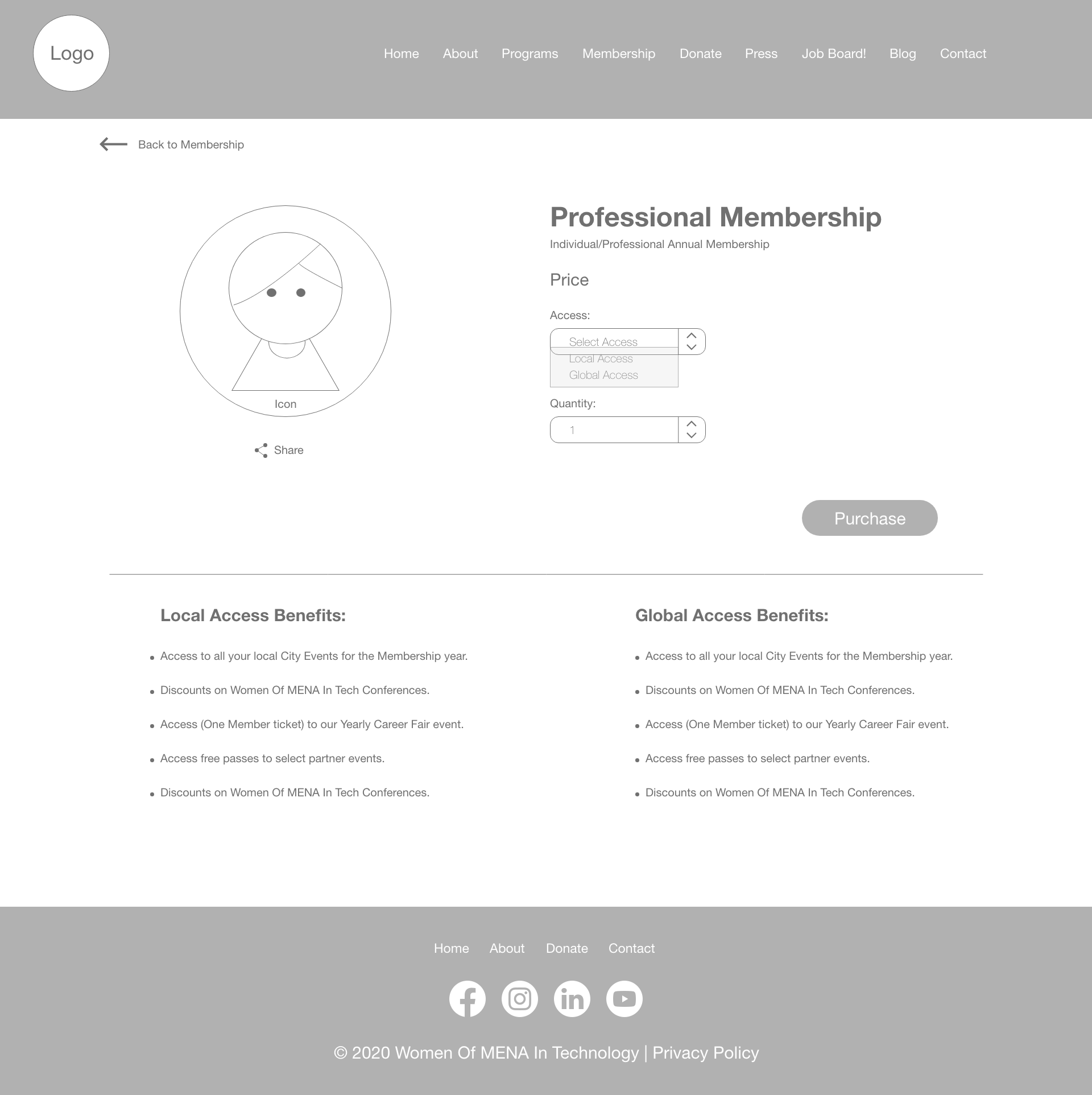
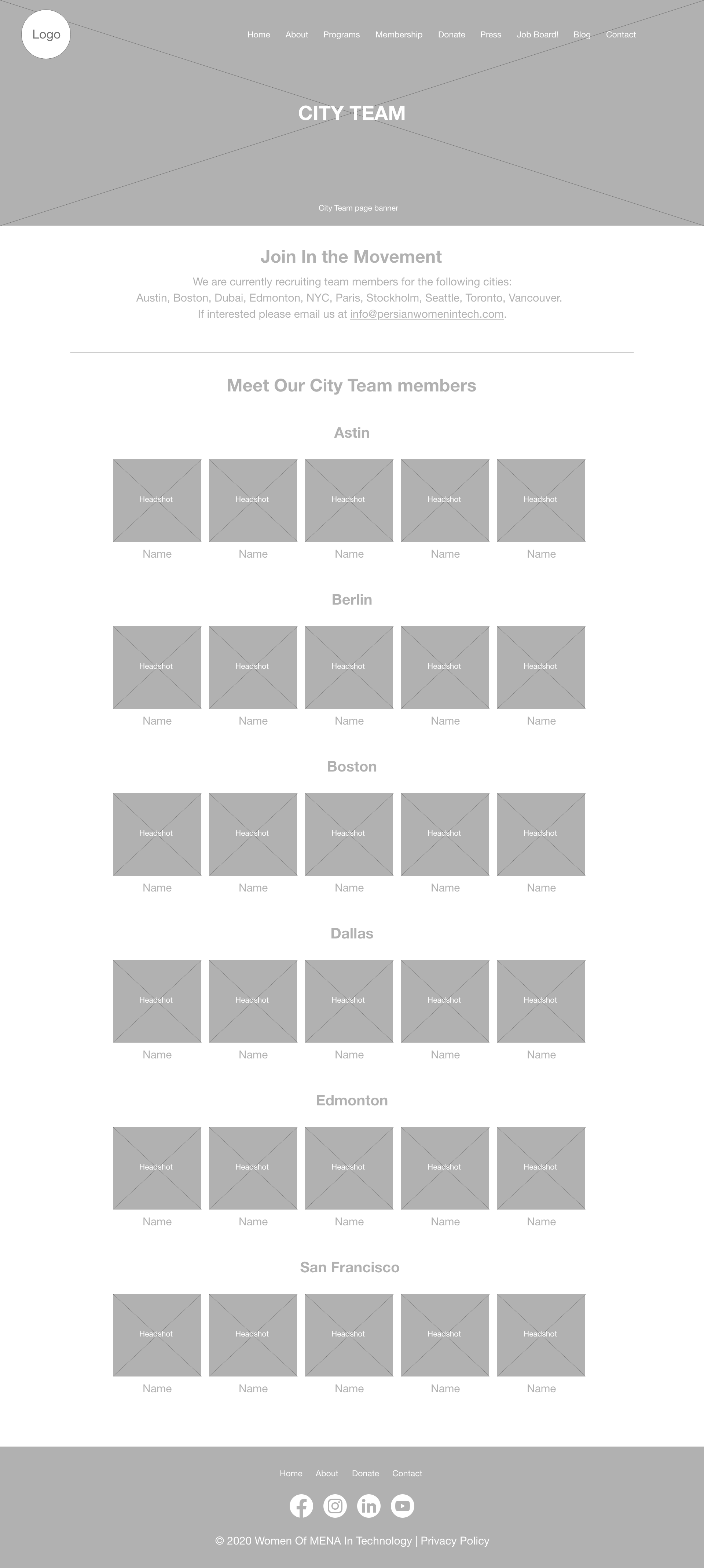
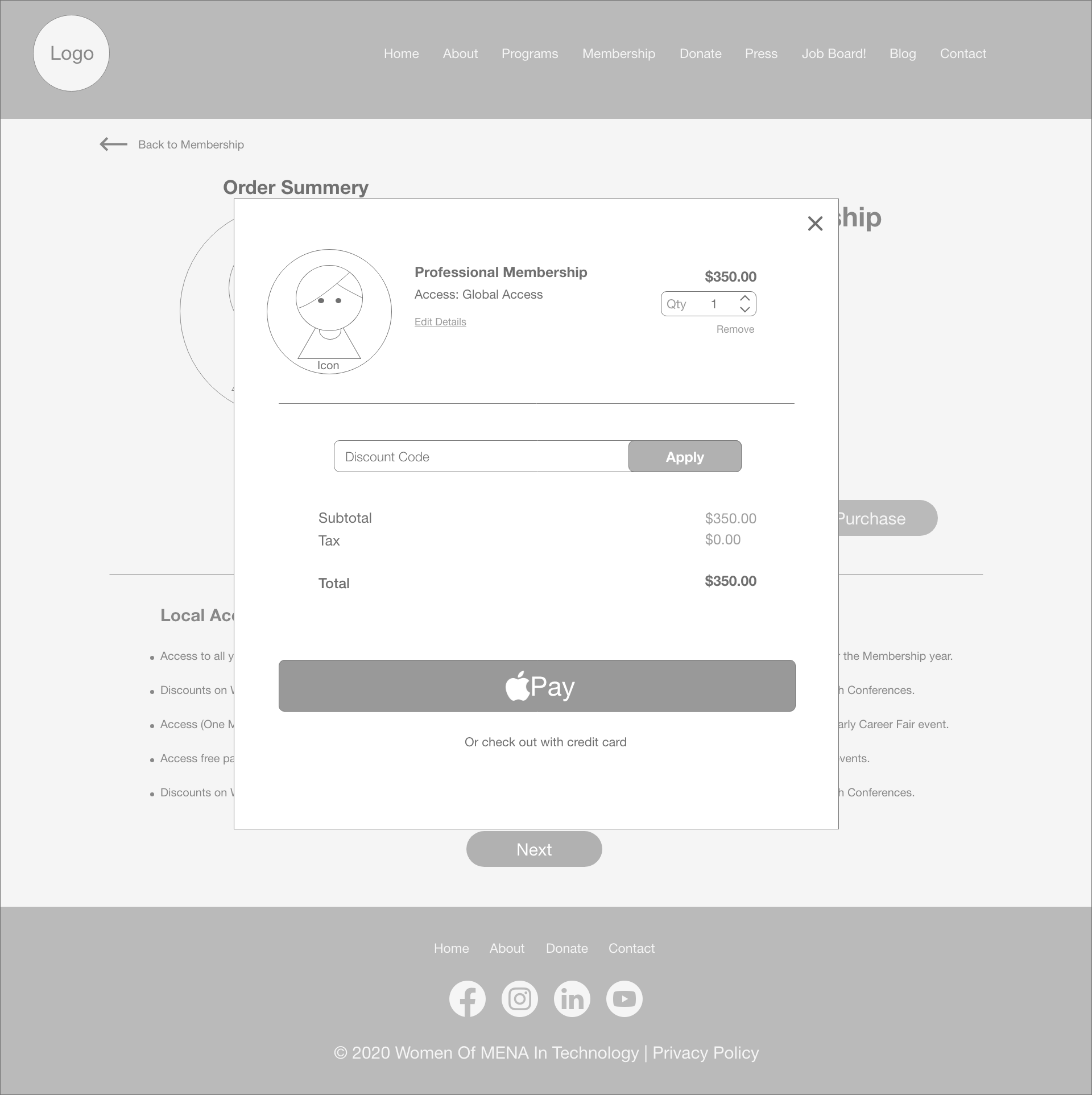
Sketch every page.
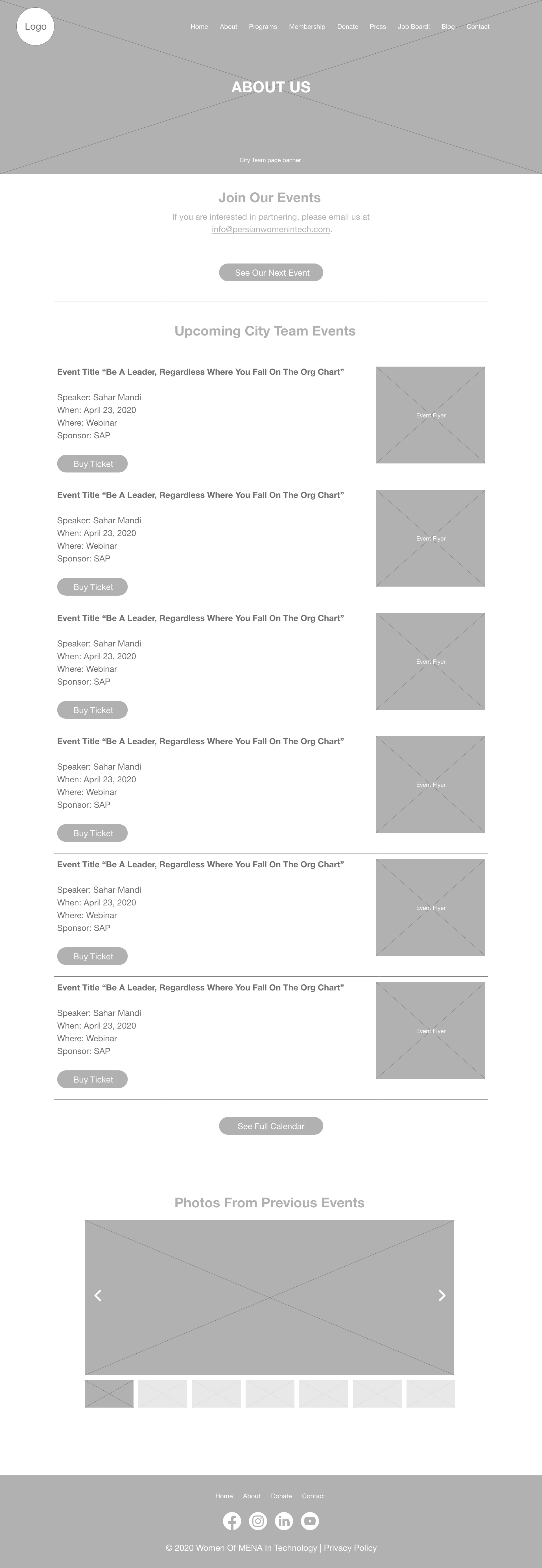
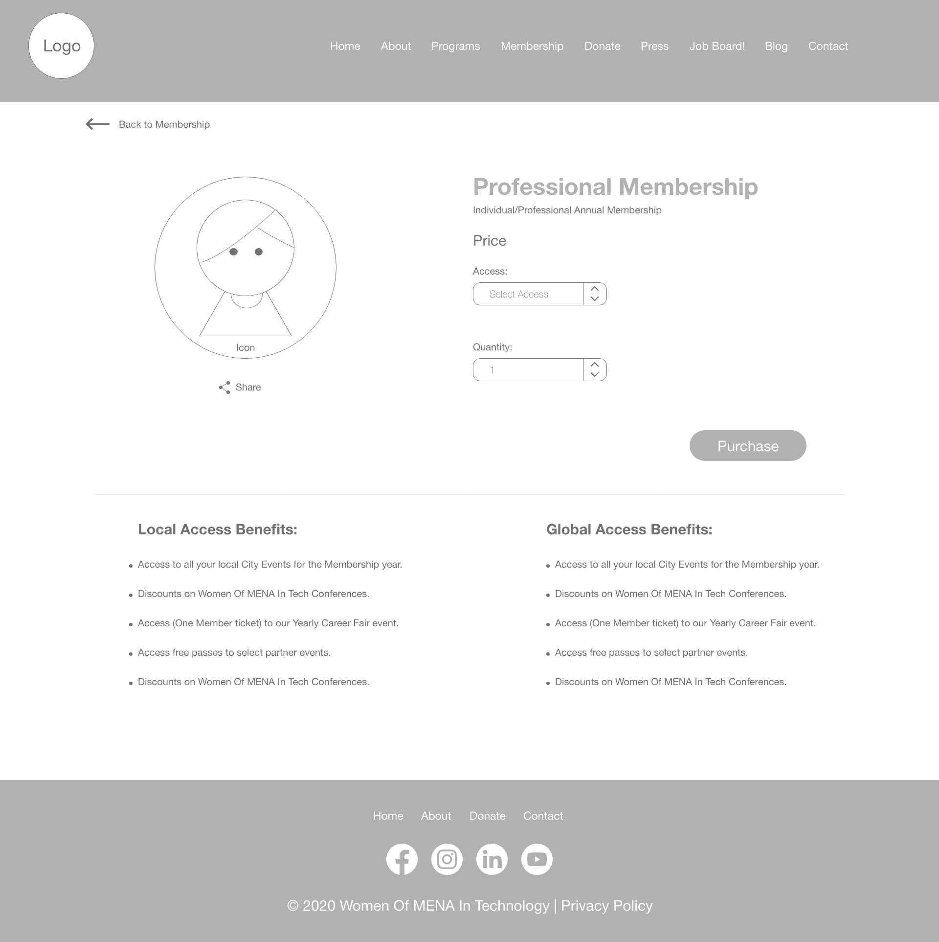
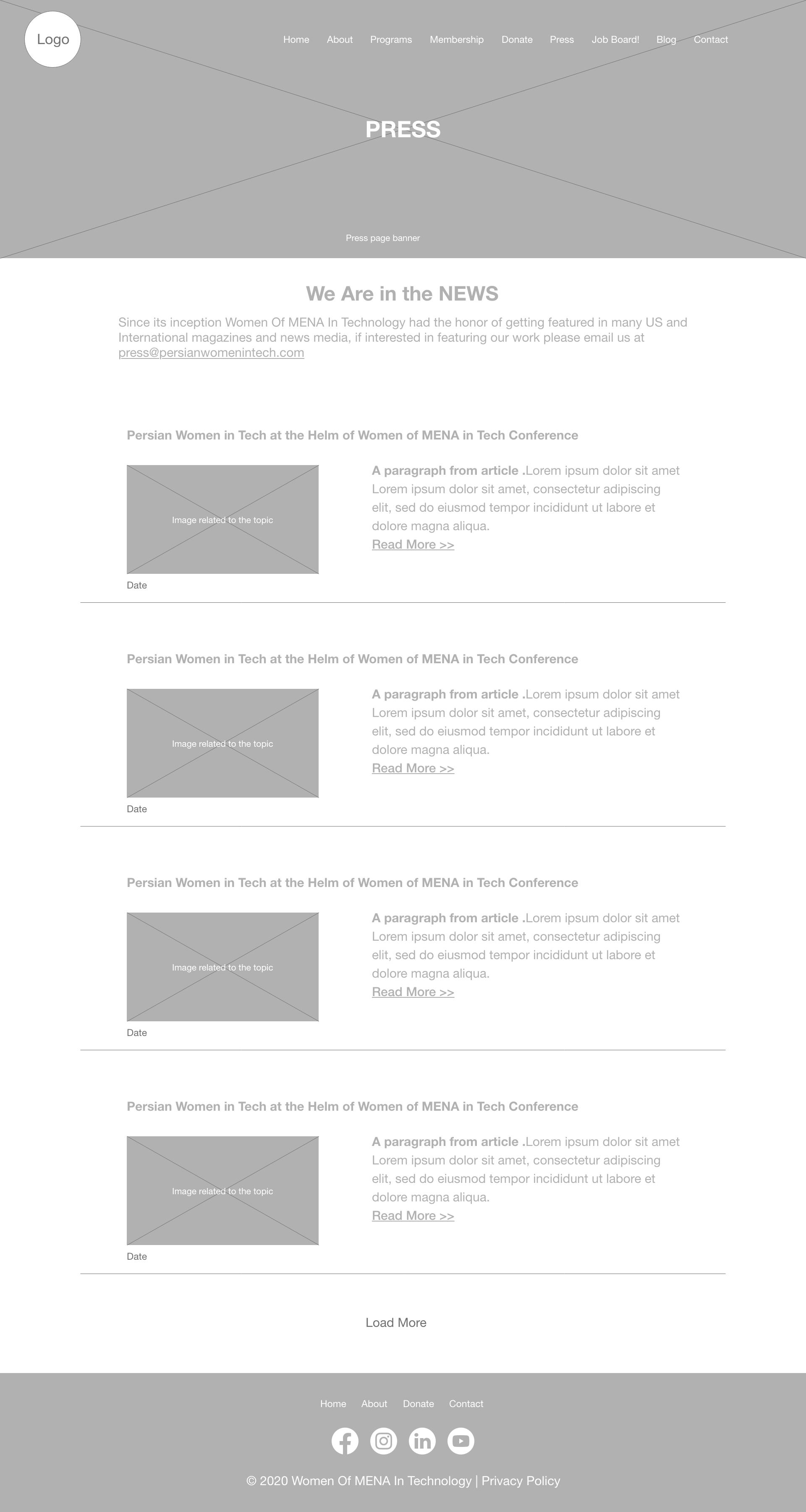
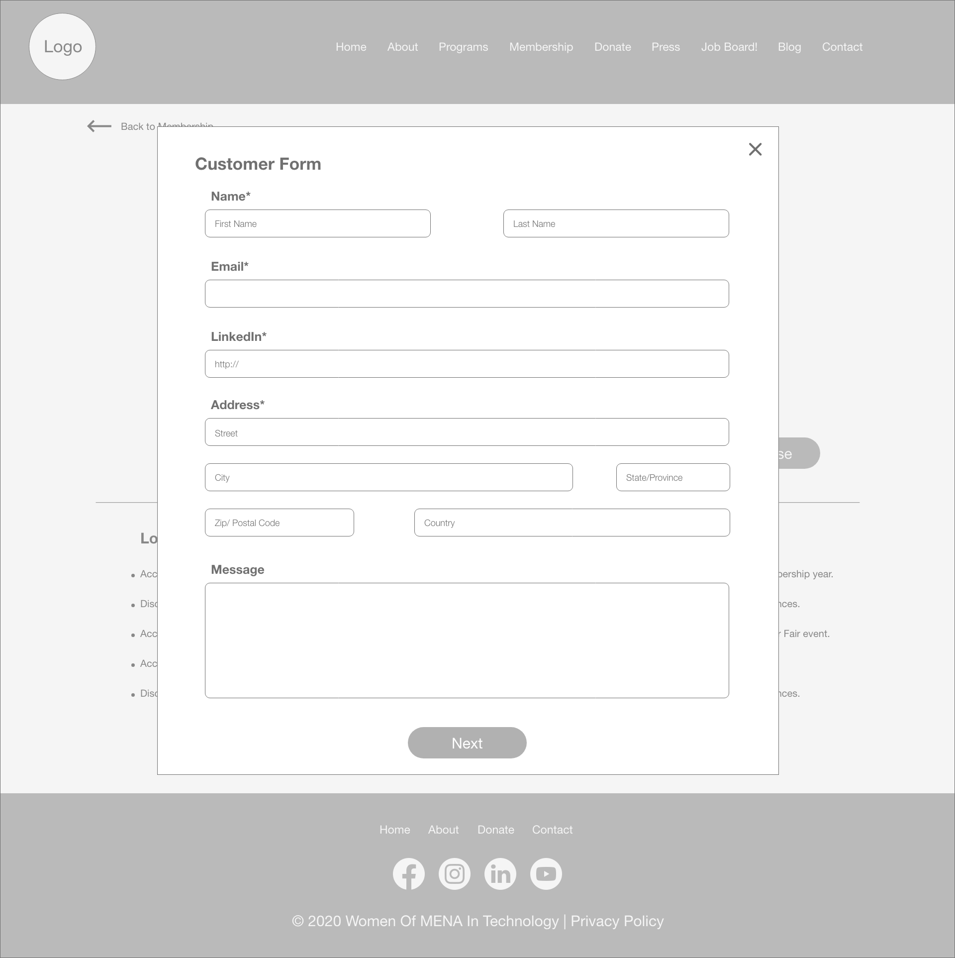
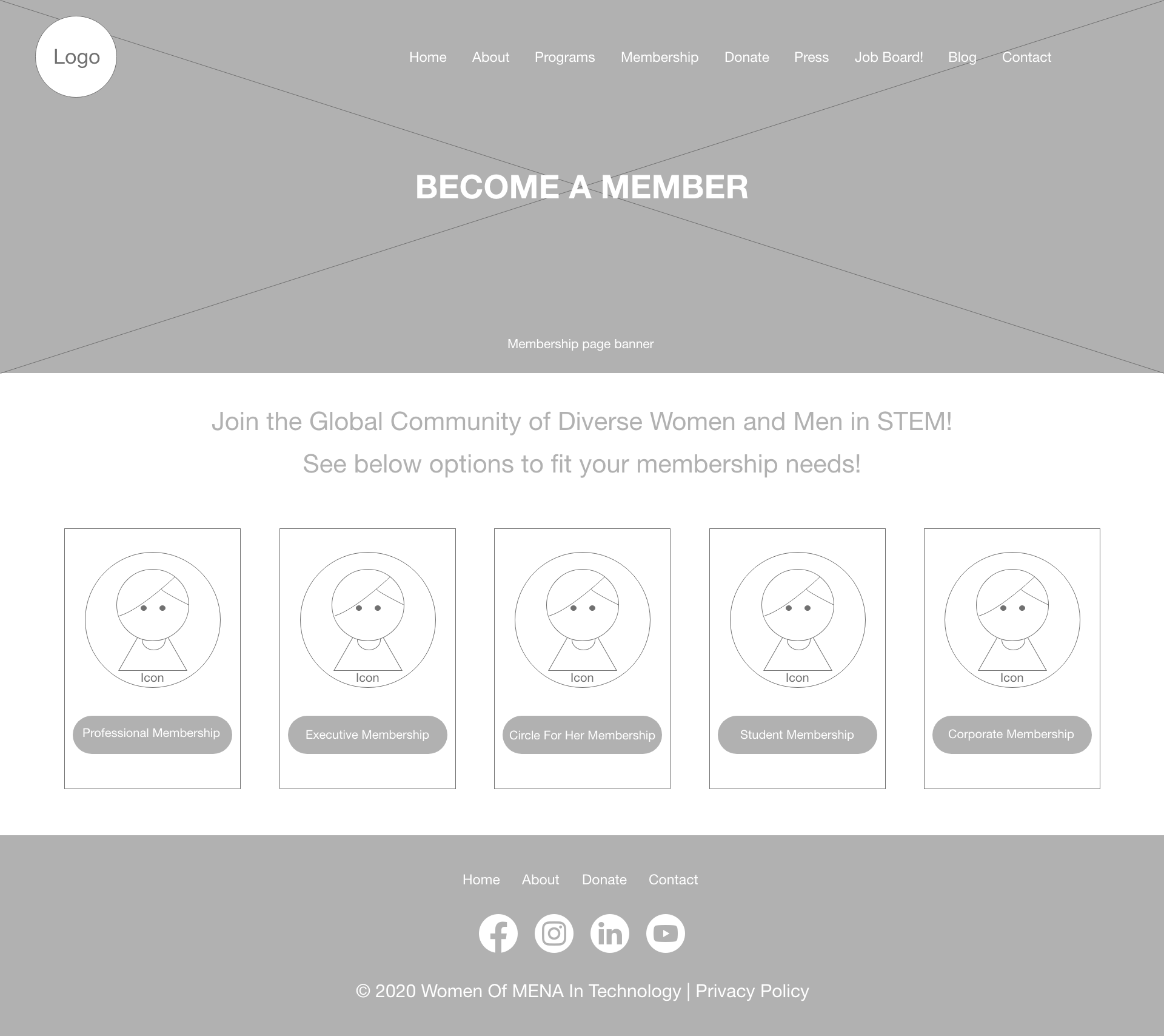
I turned the flow into wireframes for the home page, the membership page, and each step of checkout, so the product manager and developers could see the whole journey early. Click any wireframe to see the full page.
Test before going high fidelity.
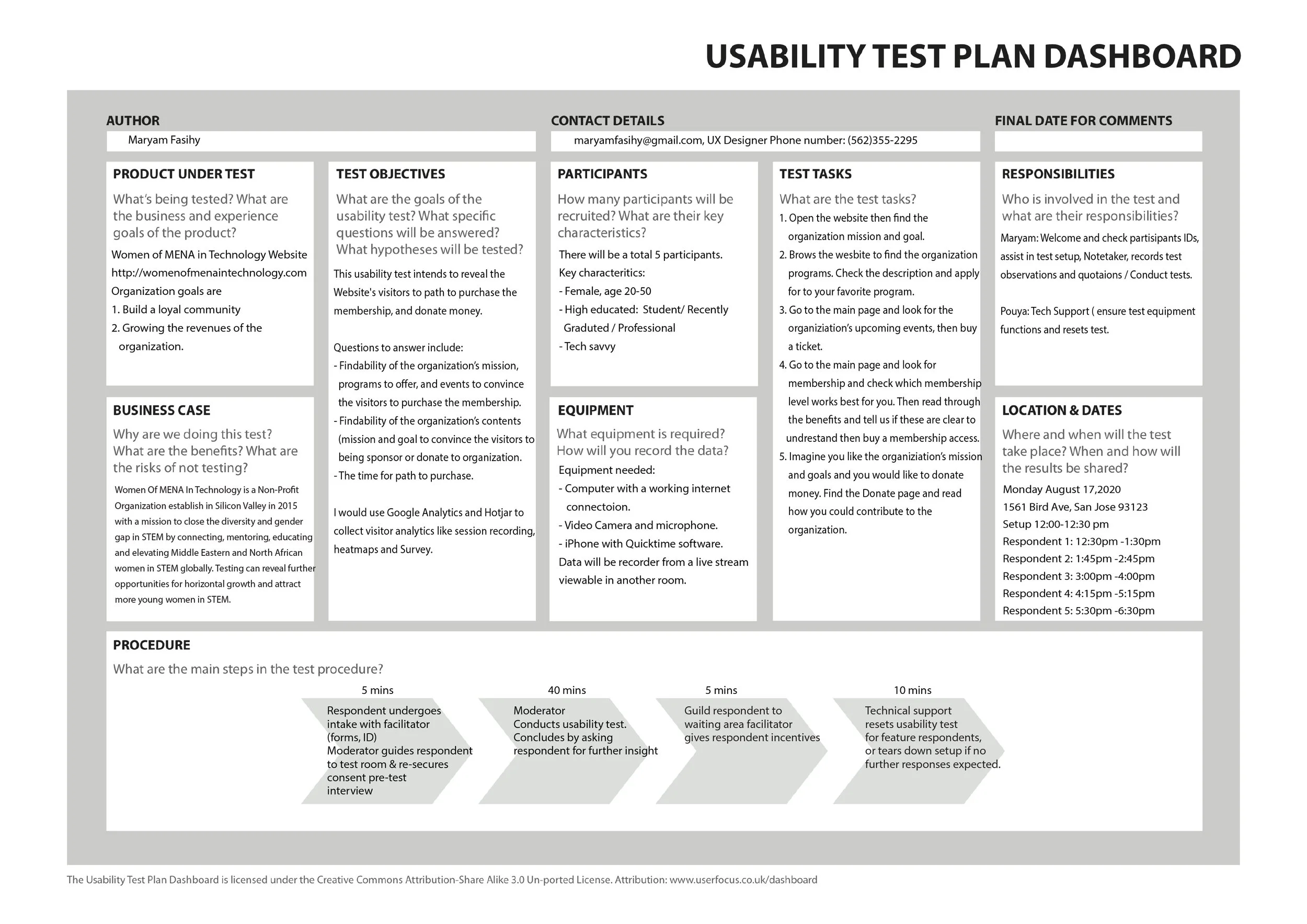
Right after the wireframes, I ran remote, think-aloud sessions with 5 people from the target audience to find repeated problems early.
Solutions
Three changes to grow membership and revenue.
Membership up front
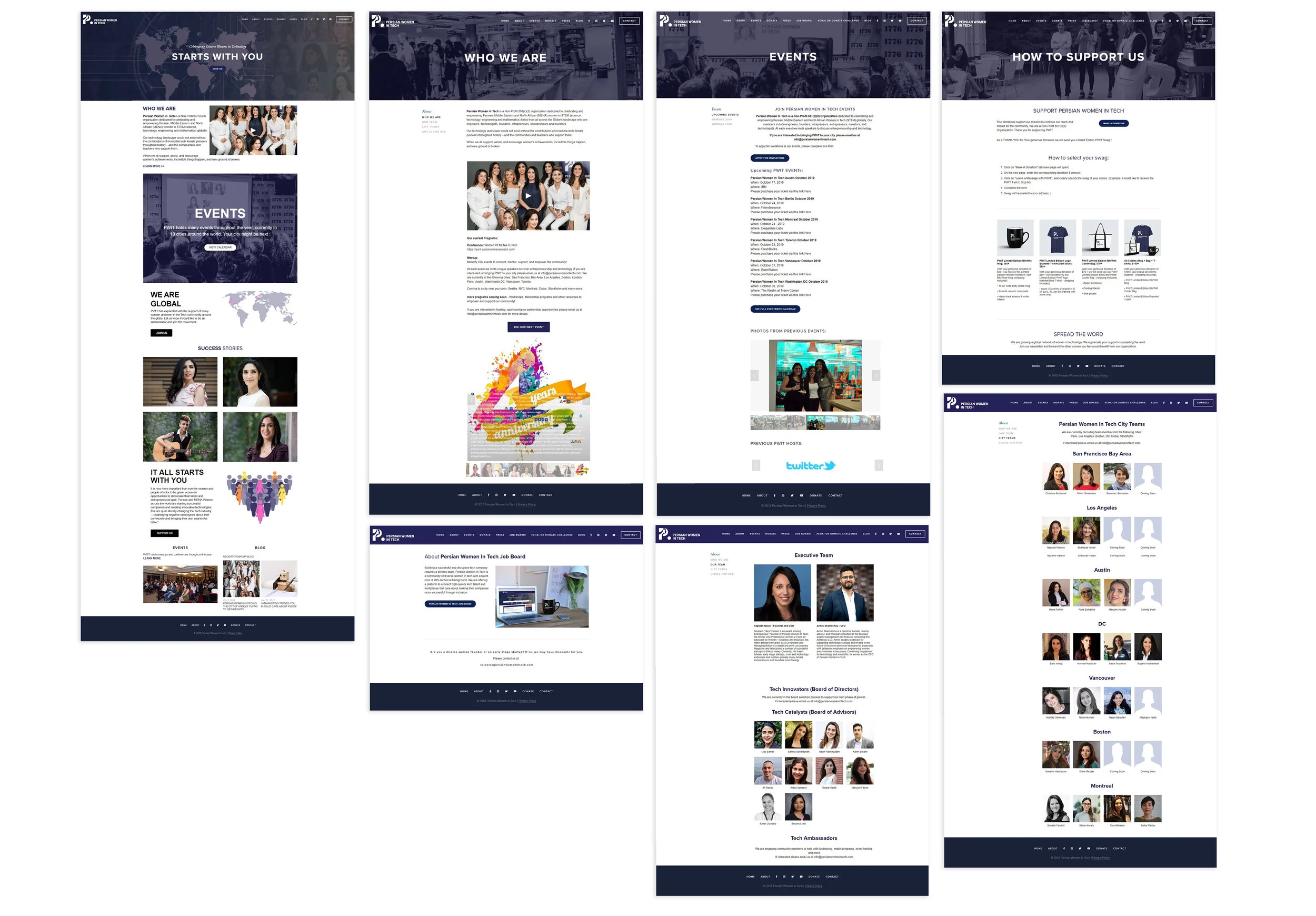
Membership now appears on the home page, each option lists its benefits so people can compare, and there are more ways to donate, including monthly.
A clear path to join
A wireflow shows every step from the home page to a paid membership, with feedback at each step so people know their choice went through.
A clickable prototype
Type, color, and imagery that fit the organization's brand, brought together in a prototype I reviewed with the product manager and developers.
What happened
70% enjoyed using the new site. 30% still found buying a membership hard, which led to clearer options and benefits, and 40% raised donation issues, which led to more ways to donate.
Analytics showed 43.7% of visitors used phones and most came from the US and Canada, so I recommended a better mobile site and outreach in the Middle East and North Africa.