
Unified Access with Single Sign-On
Merging two separate business sign-in pages into one secure, AT&T-branded sign-in, with one username and password.
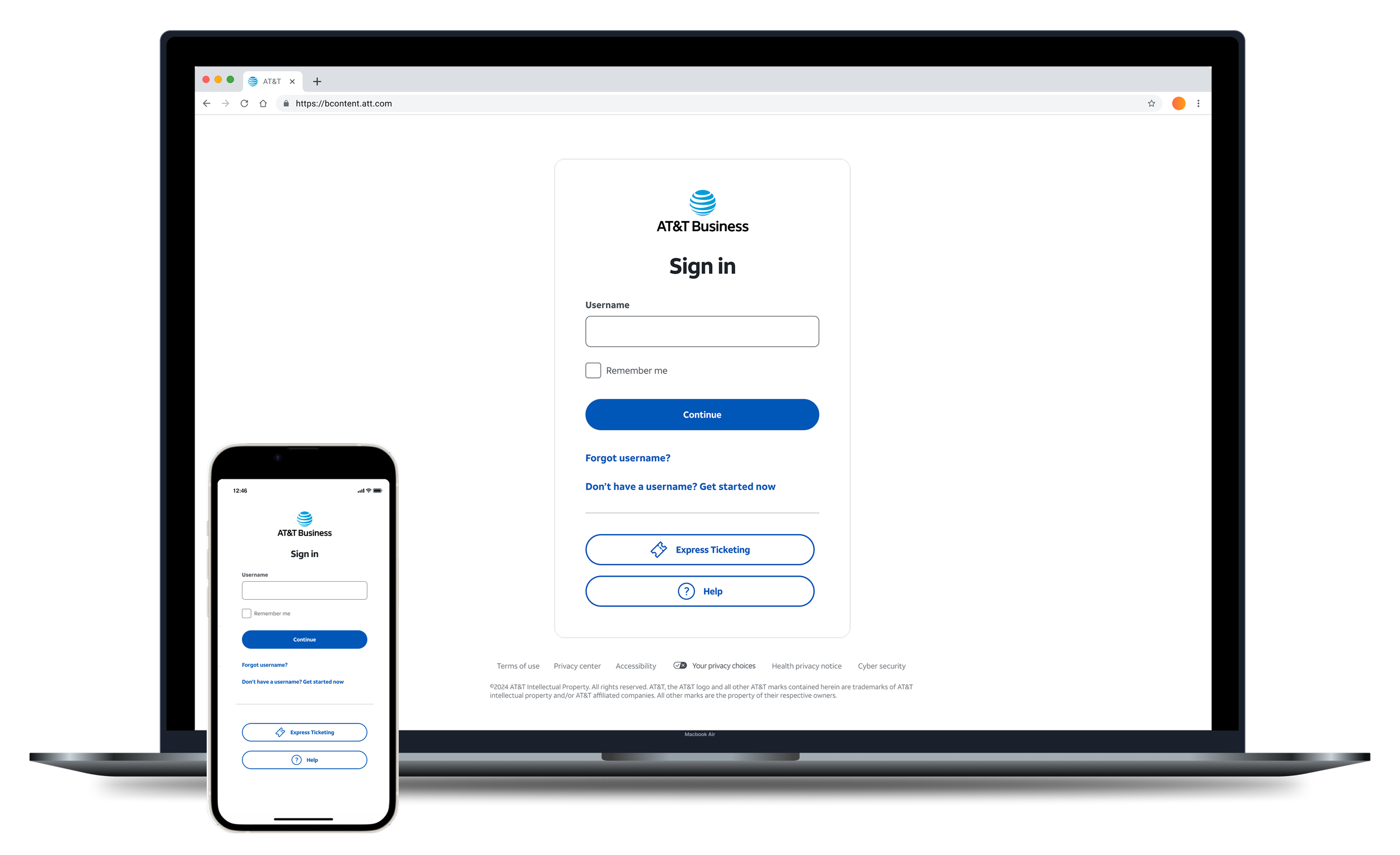
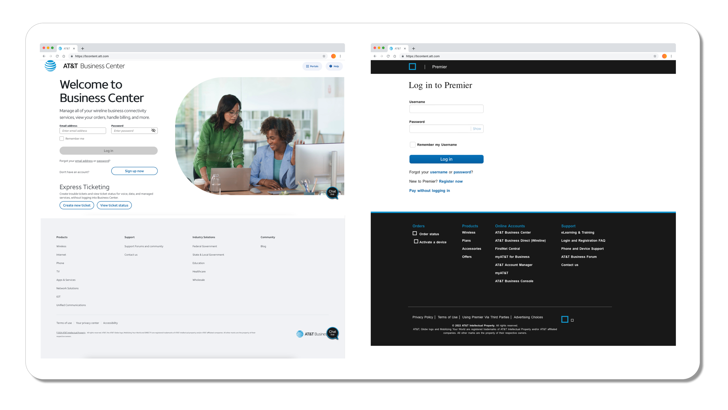
Business customers had to move between two separate sign-in pages. It was confusing, slow, and raised security concerns.
I interviewed users and ran usability studies, audited both pages, and designed one sign-in page with a step-by-step flow, consistent wording, and a full set of error messages.
The new sign-in launched. In usability testing, sign-in was 15% faster and users were more satisfied.
Two sign-in pages for the same customers
AT&T business customers had two different places to sign in. They had to know which one to use. The goal was one AT&T-branded page where customers sign in with one username and password, without making security weaker.
Confusion
Customers weren't sure which page to use.
Wasted time
Moving between two pages added steps to something people do every day.
Security concerns
Two separate entry points meant two places to protect.
What users told us
I interviewed AT&T Business portal users and ran usability studies to understand where signing in broke down. Two problems came up again and again.
Too many ways in
Multiple sign-in points slowed people down and left them unsure they were in the right place.
Words that didn't match
The same things had different names on each platform, which made the process harder to follow.
These findings led to two of the biggest decisions in the project: a split sign-in flow and one set of standard terms.
The important parts were hard to find
I reviewed both existing pages to see what got in the way of the main task: signing in.
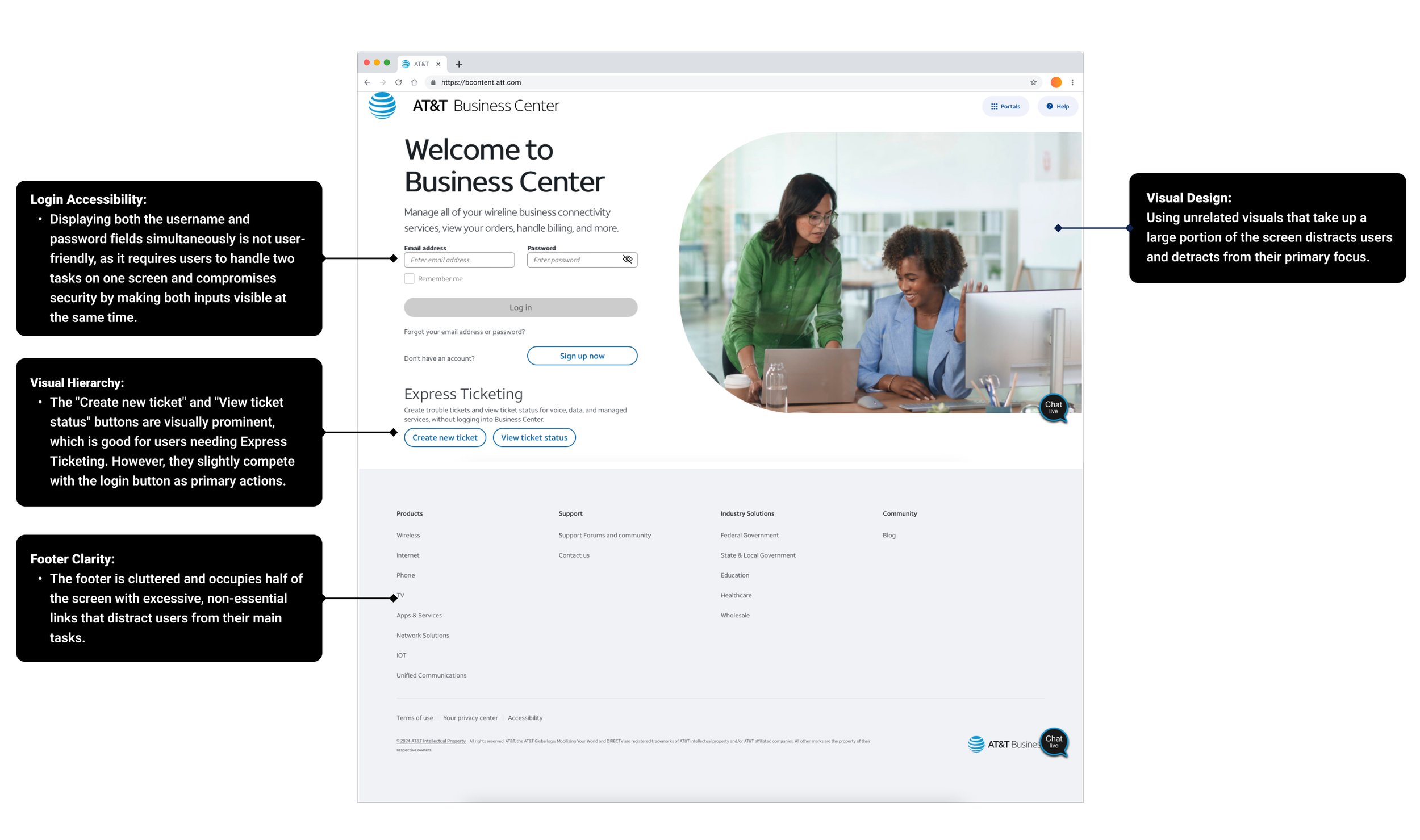
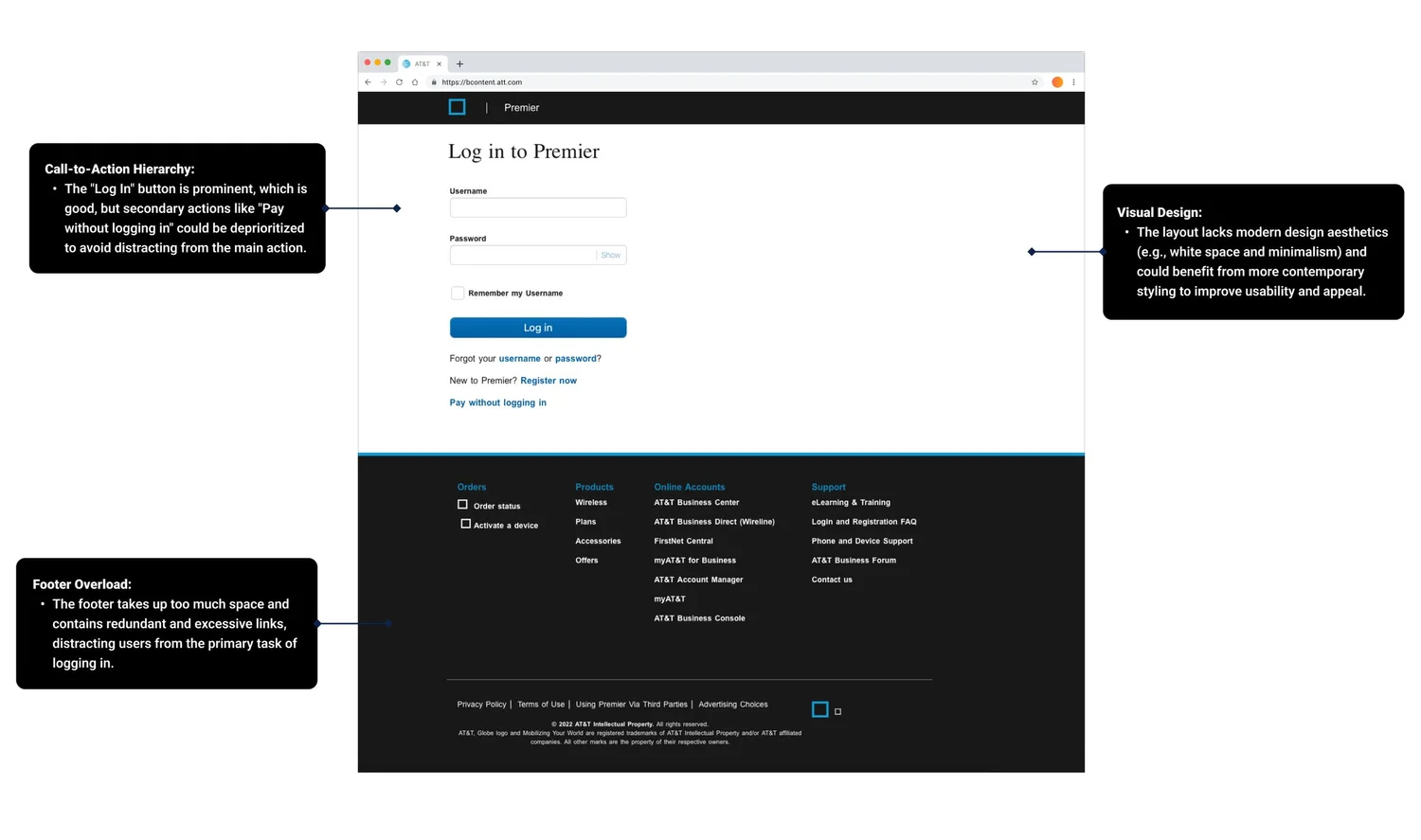
A huge hero image
It looked nice but pushed the sign-in form and key content below the fold.
Competing links
Secondary links like "Sign up now" and "Forgot password" pulled attention away from signing in.
A crowded footer
Even after earlier cleanups, the footer had so many links that it overwhelmed people.
One page, one step at a time
I merged the two pages into one and cleared away everything that competed with signing in.
One sign-in page
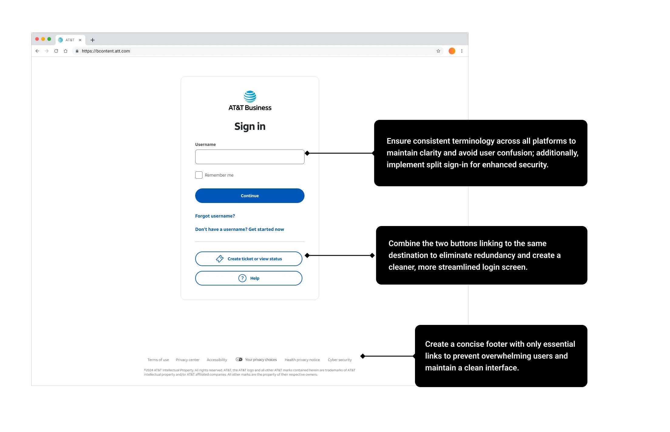
Merged both screens into one simple, AT&T-branded page.
Form first
Made the hero image smaller so the sign-in form sits above the fold.
Quieter extras
Grouped secondary links below the main button so they're easy to find but don't compete.
A lighter footer
Collapsed footer categories and kept only the essential links.
The same words everywhere
Used one set of terms across every screen, so people always know what is being asked.
Split sign-in
Asked for the username first and the password on the next step.
Why split sign-in?
Here is why I chose to ask for the username and password on separate steps.
Once the system knows who is signing in, it can add the right checks, like two-factor authentication, before asking for a password.
One field at a time means less to think about on each screen.
It's easier to show the right message, and to help with a forgotten username or password, without crowding the screen.
Designing for every way it can go wrong
Signing in is where small problems feel the most frustrating. I mapped out every scenario I could find, from empty fields and wrong formats to system outages and account recovery, and wrote a clear, friendly message for each one. Every message says what happened and what to do next.
All error scenarios
Scroll sideways →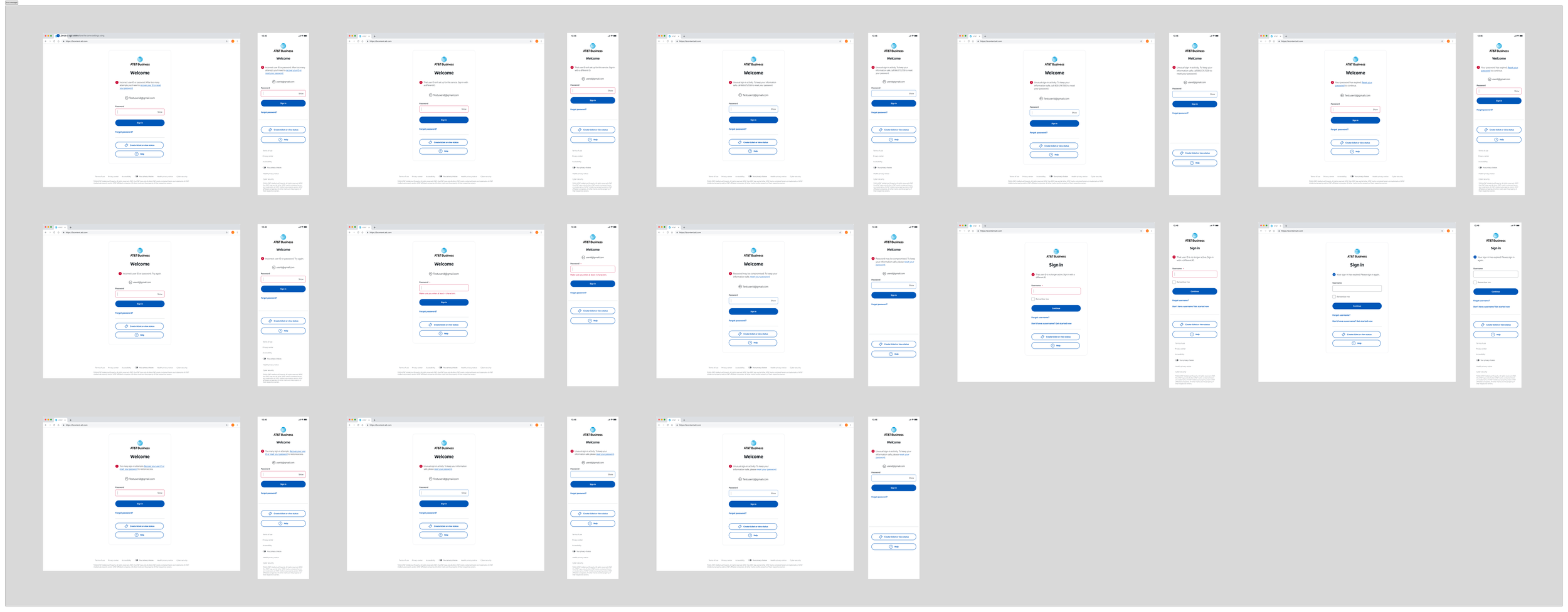
From prototype to launch
I worked closely with front-end and back-end developers, testers, and architects. I gave them detailed design documentation and prototypes for every flow, and we refined the screens and interactions through several rounds of testing.
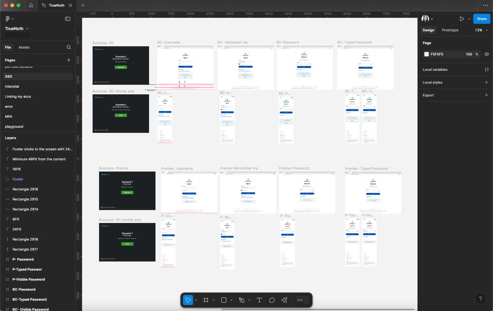
Simple on the surface, secure underneath
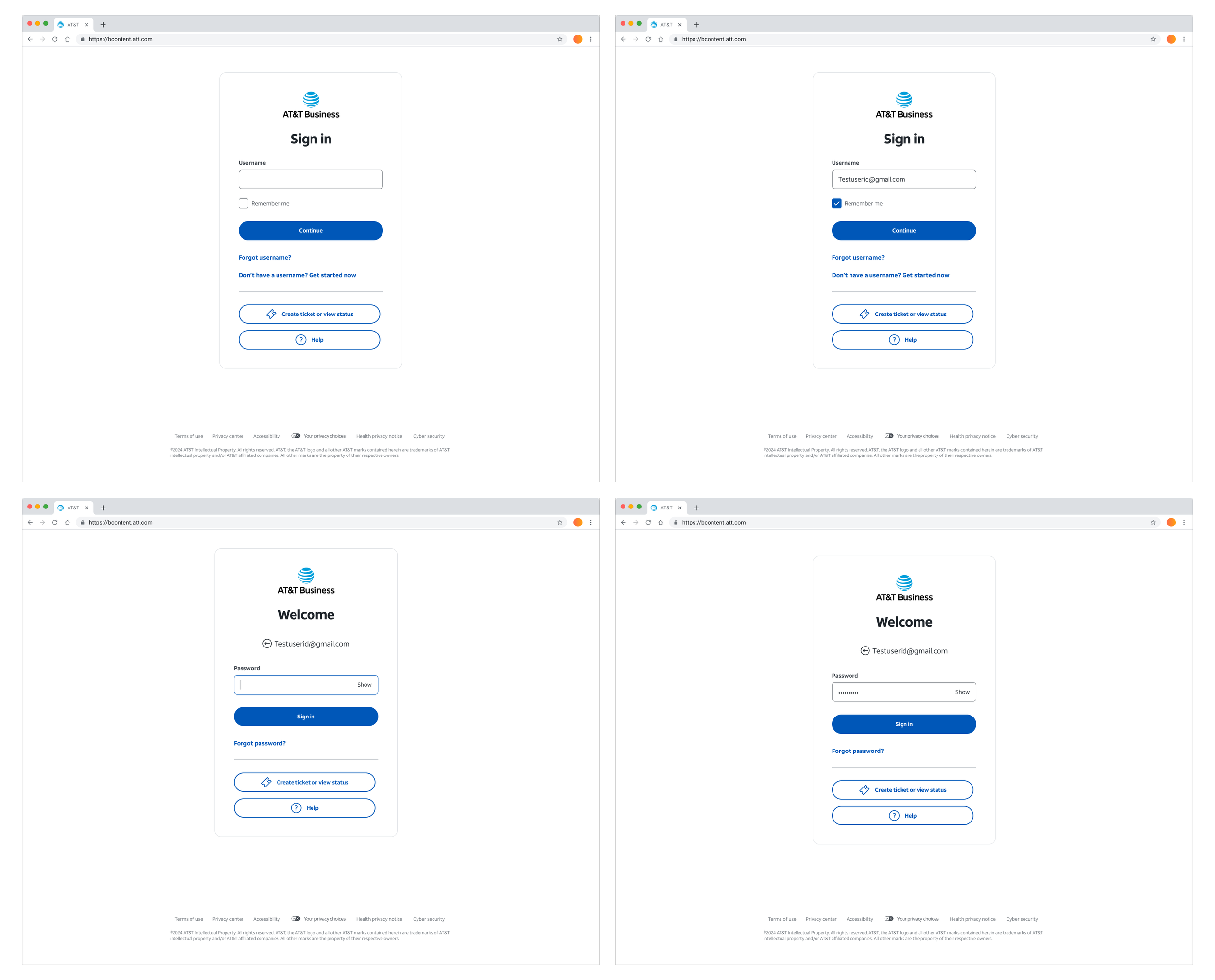
Clean layout
Plenty of white space and nothing extra to distract.
One clear action
A prominent "Continue" button guides people through each step.
Help when needed
"Forgot username?" and "Pay without signing in" are there, just quieter.
Essential footer
Only the links people actually need.
Faster, clearer, and live
The new sign-in launched for AT&T business customers. Usability testing on UserZoom showed clear improvements.
Happier users
People reported higher satisfaction with a more intuitive sign-in.
Stronger security
The split flow helps protect against phishing and stolen-password attacks.
One front door
Customers now have one place and one set of credentials to sign in.
Smaller steps help
Breaking a task into steps made it easier, even when it added a screen.
Essentials first
Putting the most important things first made the page easier to take in.
Test, then test again
Each round of testing turned into a measurable improvement.